
Following assignment instructions in the video create a cat with custom features and share your cats and code below.
1 Like
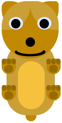
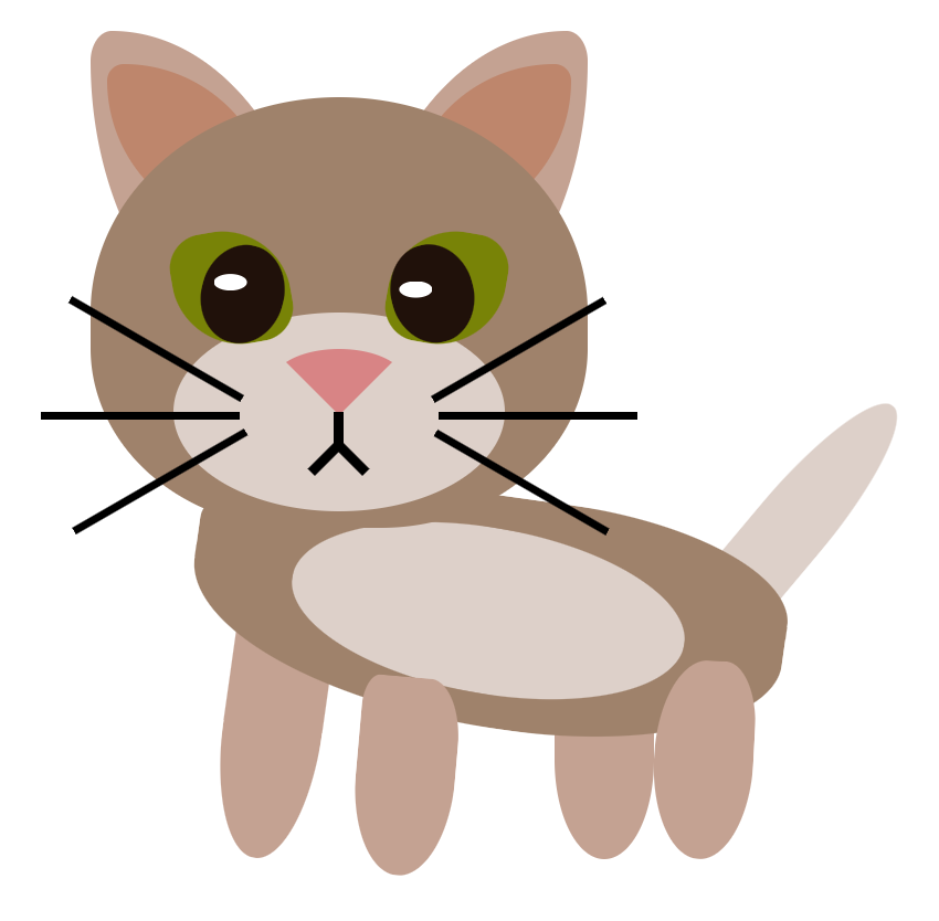
#Not a CSS expert but a makeshift cat```
        <div id="body">
            <div class="face">
                <div class="ears">
                    <div class="ear left_ear"></div>
                    <div class=" ear right_ear"></div>
                </div>
                <div class="eyes">
                    <div class="eye">
                        <div class="pupil"></div>
                    </div>

                    <div class="eye">
                        <div class="pupil"></div>
                    </div>
                </div>
                <div class="nose"></div>
                <div class="mustaches">
                    <div class="mustache mustache_left"></div>
                    <div class="mustache mustache_right"></div>
                </div>
                <div class="mouth"></div>
            </div>

            <div class="chest"></div>
            <div class="tail"></div>

        </div>
    </div>

</body>
#body{
    background-color: rgb(250, 160, 125);
    width: 400px;
    height: 400px;
}

.face{
    background-color: rgba(250, 246, 125);
    width: 200px;
    height: 200px;
    border-radius: 50%;
    position: absolute;
        left: 100px;
}

.eyes{
    display: flex;
    top: 30px;
    position: relative;
}

.eye{
    background-color: white;
    width: 50px;
    height: 50px;
    border-radius: 50%;
    margin: 25px;
    position: relative;
}

.pupil{
    background-color: black;
    width: 25px;
    height: 25px;
    border-radius: 50%;
    margin: 12px;
    position: absolute;
        left: 0px;
        top:0px;
}

.nose{
    background-color: black;
    border-radius: 50%;
    width: 25px;
    height: 25px;
    position: relative;
    left: 90px;
}

.mustaches{
    position: relative;
}

.mustache{
    height: 20px;
    width: 25;
    border: solid;
    border-radius: 0% 0% 100% 100%;
    border-top: none;
    border-left: none;
    position: absolute;
}

.mustache_left{
    left: 76px;
}
.mustache_right{
    transform: scale(-1,1);
    left: 102px;
}

.mouth{
    height: 20px;
    width: 30px;
    border: solid;
    border-radius: 100% 100% 100% 100%;
    border-top: none;
    border-left: none;
    border-right: none;
    position: relative;
    left: 87px;
    top: 10px;
}


.curved{
    width: 50px;
    height: 40px;
    border: solid;
    border-radius: 100% 100% 90% 90%;
    position: absolute;
        left: 75px;
        top: 70px;
    border-bottom: none;
}


.ears{
    position: relative;
}

.ear{
    background-color: rgba(250, 246, 125);
    border-radius: 90% 0% 90% 0%;
    width: 100px;
    height: 100px;
    position: absolute;
}

.left_ear{
    left: 0px;
    transform: scale(-1,1);
}

.right_ear{
    left: 100px;
}


.chest{
    background-color: rgba(250, 246, 125);
    width: 200;
    height: 200px;
    position: absolute;
    left: 100px;
    top: 195px;
    border-radius: 90% 90% 10% 10%
}

.tail{
    background-color: rgba(250, 246, 125);
    width: 200;
    height: 20px;
    position: absolute;
    left: 173px;
    top: 365px;
}
Finally done ooof, that was much more work than i thought, i was superbored at first but at the end i got the hang of it and i would not say that i was enjoying it xD, but at least i was more focused on the project and not in how boring it was xp .
Cat html
<html>
    <head>
        <link rel="stylesheet" href="style.css">
    </head>
    <body>
        <div class="Cat">
            <div class="tail"></div>
            <div class="legs">
                <div class="leg left_leg"></div>
                <div class="leg right_leg" style="
                    left: 130px;
                "></div>
            </div>
            <div class="catsbody">
                <div class="tummy"></div>
                <div class="arms">
                    <div class="arm right_arm">
                        <div class="paw right_paw"></div>
                            <div class="fingers right_fingers"></div>
                    </div>
                    <div class="arm left_arm" style="
                     right: 95px;
                    ">
                        <div class="paw left_paw" style="
                        right: 7px;
                        ">
                            <div class="fingers left_fingers" style="
                                top: 3px;
                                left: 10px;
                            "></div>
                    </div>

                    </div>
                </div>
            </div>
        </div>
            <div class="head">
                <div class="ear left_ear" style="
                    left: 110px;
                ">
                    <div class="insides left_inside"></div>
                </div>
                <div class="ear right_ear" style="
                    transform: scale(-1,1);
                    ">
                    <div class="insides right_inside"></div>
                </div>

            <div class="catsFace">
                <div class="foreHead">
                    <div class="lines line1" style="
    left: 110px;
    transform: rotate(10deg);
    top: 2px;
"></div>
                    <div class="lines line2" style="
    left: 81px;
    transform: rotate(-10deg);
    top: 2px;
"></div>
                    <div class="lines line3"></div>
                </div>
                <div class="patch left_patch" style="
                    left: 119px;
                    transform: scale(-1,1);">
                </div>
                <div class="patch right_patch"></div>

                <div class="eyes">
                    <div class="eye left_eye" style="
                        left: 120px;
                    ">
                        <div class="pupils left_pupil" style="
                        left: 5px;
                        ">
                            <div class="iris left_iris">
                                <div class="shine left_shine"></div>
                                <div class="shine2 left_shine2"></div>
                            </div>
                        </div>
                    </div>
                    <div class="eye right_eye" style="
                        left: 30px;
                    ">
                        <div class="pupils right_pupil" style="
                        left: 10px;
                        ">
                            <div class="iris right_iris">
                                <div class="shine right_shine"></div>
                                <div class="shine2 right_shine2"></div>
                            </div>
                        </div>
                    </div>

                </div>
                <div class="leftwhiskers">
                    <div class="whiskyL left_whisk1" style="
                        top: 122px;
                        transform: rotate(-5deg);
                   "></div>
                    <div class="whiskyL left_whisk2"></div>
                    <div class="whiskyL left_whisk3" style="
                       top: 138px;
                       transform: rotate(5deg);
                    "></div>
                </div>
                <div class="rightwhiskers">
                   <div class="whiskyR right_whisk1" style="
                       top: 122;
                       transform: rotate(5deg);
                    "></div>
                    <div class="whiskyR right_whisk2"></div>
                    <div class="whiskyR rigth_whisk3" style="
                       top: 138;
                       transform: rotate(-5deg);
                    "></div>
                </div>

                <div class="barba">

                    <div class="mouth">
                        <div class="lips right_lip" style="
                            transform: scale(-1,1);
                        "></div>
                        <div class="lips leftt_lip" style="
                            left: 39px;
                            top: -20px;
                        "></div>
                        <div class="nose"></div>

                    </div>

                </div>


            </div>

        </div>

        </div>

    </body>
</html>
Cat css
.head{
    width: 250px;
    height: 250px;
    position:relative;
    top:-130
}
.ear{
    border-radius: 70% 10% 50% 30%;
    background-color: rgb(20 20 20 / 1);
    height: 100px;
    width: 100px;
    position:absolute;
    left:5;
}
.insides{
    border-radius: 70% 10% 50% 30%;
    background-color: rgb(254 255 248 / 40%);
    height: 40px;
    width: 40px;
    position:absolute;
    left:53;
    top:6;
}
 .catsFace{
    background-color: rgb(20 20 20 / 1);
    width: 200px;
    height: 200px;
    border-radius: 50%;
    position:absolute;
    left:10;
    top:10;
}
.patch{
    position:absolute;
    background-color: rgb(150 0 0/80%);
    border-radius: 15% 45% 45% 55%;
    width: 60px;
    height: 50px;
    top:61;
    left:25;
}
.lines {
    position:absolute;
    background-color: rgb(20 20 20);
    border-radius: 25% 25% 65% 65%;
    width: 10px;
    height: 40px;
    left:96;
}
.eyes{
    position:relative;
    top: 55;
    display:flex;

}
.eye{
    border: solid 2px;
    border-color: rgb(20 20 20 / 1);
    position: absolute;
    background-color: rgb(245 222 222);
    border-radius: 50%;
    width: 50px;
    height: 50px;
}
.pupils{
    position: absolute;
    background-color: rgb(27, 9, 9);
    border-radius: 50%;
    width: 35px;
    height: 35px;
    top: 10;
}
.iris {
    border: solid 1px;
    border-color: rgb(20 20 20 / 35%);
    position: absolute;
    background-color:rgb(150 0 0 );
    border-radius: 50%;
    width: 13px;
    height: 25px;
    left:10;
    top:6;
  }
  .shine {
    position: absolute;
    background-color:rgb(255 255 255 / 77%);
    border-radius: 50%;
    width: 4px;
    height: 7px;
    left:11;
    top:8;
  }
  .shine2 {
    position: absolute;
    background-color:rgb(255 255 255 / 85%);
    border-radius: 50%;
    width: 3px;
    height: 4px;
    left:8;
    top:15;
  }
.barba {
    position: relative;
    background-color:rgb(240 220 220 / 0%);
    border-radius: 40% 40% 50% 50%;
    width: 150px;
    height: 85px;
    left:26;
    top:110;
  }
.nose{
    border:solid 2px;
    border-color: rgb(197 2 2 / 39%);
    background-color:rgb(255 120 120 );
    height:13px;
    width: 20px;
    position:relative;
    border-radius:30% 30% 79% 79%;
    top:-50;
    left:64;
}
.lips {
    width: 28px;
    height: 20px;
    border: solid 4px rgb(255, 255, 255);
    border-color: #fbfbfb00 rgb(150 0 0) rgb(150 0 0);
    border-radius:  50% 50% 60% 60%;
    position:relative;
    top:8;
    left:75;
  }
  .whiskyL {
    position:absolute;
    flex: 1 1;
    border-bottom: 5px solid rgb(110 0 0);
    width:75px;
    margin: auto;
    top:130;
    left:133
}
.whiskyR {
    position:absolute;
    flex: 1 1;
    border-bottom: 5px solid rgb(110 0 0);
    width:75px;
    margin: auto;
    top:130;
    right:132;
}
  .catsbody {
    background-color: rgb(20 20 20 / 1);
    width: 150px;
    height: 150px;
    border-radius: 30% 30% 40% 40%;
    position:relative;
    left:31;
    top:195;
  }
  .tummy{
    width:80px;
    height: 100px;
    border-radius: 70% 70% 70% 70%;
    background-color:rgb(90 0 0);
    position:absolute;
    top:40;
    left:37;
  }
  .arms{
    position:absolute;
    display:flex;
  }
  .arm {
    position: relative;
    background-color: rgb(20 20 20);
    border: solid 3px;
    border-color:rgb(35 15 15 / 0%) rgb(202 0 0 / 30%);
    width: 33px;
    height: 95px;
    border-radius: 15% 15% 40% 40%;
    margin:53;
    right:44;
  }
  .paw {
    position:relative;
    background-color: rgb(150 0 0);
    border: solid 2px;
    border-color: rgb(20 20 20/ 50%);
    width: 43px;
    height: 30px;
    border-radius: 60% 60% 40% 40%;
    top:80;
    right:7;
  }
  .fingers {
    width: 15px;
    height: 22px;
    border: solid 4px rgb(255 255 255);
    border-color: rgb(20 20 20 / 0%) rgb(20 20 20 / 35%) rgb(80 70 40 / 0%);
    border-radius:  60px 60px 30px 30px;
    position:relative;
    top:51;
    left:5;
  }
  .legs{
    position:relative;
  }
  .leg {
    width:50px;
    height:30px;
    border: solid 2px;
    border-color: rgb(20 20 20);
    background-color:rgb(150 0 0);
    border-radius: 50% 50% 30% 30%;
    position: absolute;
    top: 320;
    left: 29;
  }
  .tail {
    width:28px;
    height: 70px;
    border-radius: 70% 70% 70% 70%;
    background-color:rgb(20 20 20);
    position:absolute;
    top:260;
    left:180;
    transform:rotate(45deg);
  }
btw the cats name is Rossonero B)
2 Likes
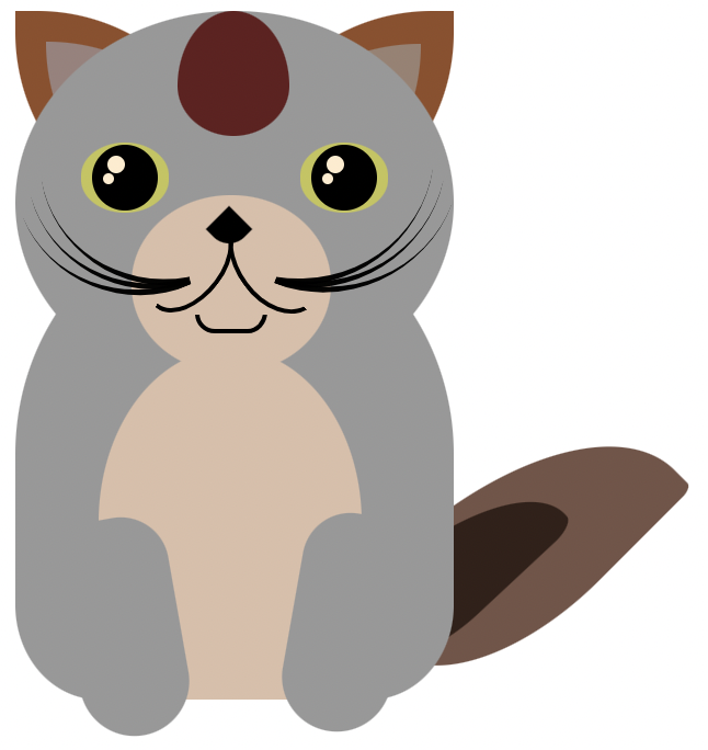
Here comes my cat, but I think in the end this project gonna be named CryptoBears, as it more looks like a bear to me. What do you all think?
Here’s the code to the CryptoBear:
index.html
<html>
<head>
    <link rel="stylesheet" href="style.css">
</head>
<body>
    <div class="cat">
        <div class="ears">
            <div class="ear left_ear"><div class="zeichnung links"></div></div>
            <div class="ear right_ear" style="left: 100px; transform: scale(1,-1);"><div class="zeichnung rechts"></div></div>
        </div>
        <div id="catHead">
            <div class="catEyes">
                <div class="eye"><div class="pupils"></div></div>

                <div class="eye"><div class="pupils"></div></div>
                <div class="nose"></div>
                <div class="mouth"></div>
                <div class="lip"></div>
            </div>
        </div>
        <div class="catBody"></div>
        <div class="catArms left up">
            <div class="catFingers"></div>
            <div class="catFingers" style="left: 17px;"></div>
            <div class="catFingers" style="left: 34px;"></div>
            <div class="pawCenter"></div>


        </div>
        <div class="catArms right up" style="left: 165px" >
            <div class="catFingers"></div>
            <div class="catFingers" style="left: 17px;"></div>
            <div class="catFingers" style="left: 34px;"></div>
            <div class="pawCenter" ></div>
        </div>

        <div class="catArms left down" style="top: 300px">
            <div class="catFingers"></div>
            <div class="catFingers" style="left: 17px;"></div>
            <div class="catFingers" style="left: 34px;"></div>
            <div class="pawCenter" ></div>
        </div>
        <div class="catArms right down" style="left: 165px; top: 300px" >
            <div class="catFingers leftUpOne"></div>
            <div class="catFingers leftUpTwo" style="left: 17px;"></div>
            <div class="catFingers leftUpThree" style="left: 34px;"></div>
            <div class="pawCenter rightDown" ></div>
        </div>
        <div class="belly"></div>
        <div class="tail"></div>


        </div>
          </div>

    </div>


</body>
</html>
style.css
#catHead {
    background-color: #c18900;
    width: 200px;
    height: 200px;
    border-radius: 59% 55% 66% 66%;
}

.ear{
    border-radius: 21px 70px 12px 70px;
    background-color: #c18900;
    height: 100px;
    width: 100px;
    position: absolute;
}


.catEyes {
    position: relative;
    top: 30px;
    display: flex;
}
.eye{
    background-color: rgb(219 231 255);
    border-radius: 50%;
    width: 66px;
    height: 44px;
    margin: 25px;
    position: relative;

}
.pupils{
    background-color: black;
    width: 33px;
    height: 33px;
    border-radius: 50%;
    position: absolute;
    top: 7px;
    left: 8px;
}

.nose{
    background-color: black;
    width: 33px;
    height: 33px;
    border-radius: 50%;
    position: absolute;
    top: 96px;
    left: 84px;
    z-index: 1;
}
.mouth{
    background-color: #000000;
    position: absolute;
    left: 46px;
    top: 132px;
    height: 30px;
    width: 108px;
    border-radius: 50%
}
.lip{
    background-color: #c18900;
    position: absolute;
    left: 51px;
    top: 124px;
    height: 30px;
    width: 96px;
    border-radius: 50%;
}

.tail {
    background-color: #c18900;
    width: 38px;
    height: 37px;
    border-radius: 50%;
    position: absolute;
    top: 389px;
    left: 92px;
    z-index: -2;
  }


.ears{
    position: relative;
}

.zeichnung{
    border-radius: 90% 0 84% 0;
    background-color: #caa036;
    height: 100px;
    width: 100px;
    position: absolute;
}
.catBody{
    background-color: #caa036;
    border-radius: 75px 75px 70px 70px;
    width: 170px;
    height: 255px;
    position: absolute;
    top: 150;
    left: 25px;
    z-index: -1;
}
.catArms{
    background-color: #c18900;
    width: 50px;
    height: 54px;
    border-radius: 15px 15px 25px 25px;
    position: absolute;
    z-index: 1;
}
.catFingers{
    background-color: #956b00;
    width: 16px;
    height: 20px;
    border-radius: 126px;
    position: absolute;
    z-index: 1;
}

.pawCenter{
    background-color: #956b00;
    width: 31px;
    height: 27px;
    border-radius: 126px;
    position: absolute;
    top: 22px;
    left: 9px;
    z-index: 1;
}
.belly{
    background-color: #f5c13d;
    width: 94px;
    height: 167px;
    border-radius: 51px;
    position: absolute;
    left: 65px;
    top: 217px;
}
6 Likes
So here is what I whipped up, not a CSS expert and also just wanted to get some experience without going into all the details. The whiskers are inspired by some code I found online.
<html>
    <head>
        <link rel="stylesheet" href="style.css">
    </head>
    <body>
        <div class="cat">
            <div class="ears">
                <div class="ear left_ear">
                    <div class="inner_ear left_inner_ear">
                    </div>
                </div>
                <div class="ear right_ear">
                    <div class="inner_ear right_inner_ear">
                    </div>
                </div>

            </div>
            <div class="cat_tail"></div>
            <div class="cat_body"></div>
            <div id="face">
                <div class="eyes">
                    <div class="eye">
                        <div class="pupils">
                        </div>
                    </div>
                    <div class="eye">
                        <div class="pupils">
                        </div>
                    </div>
                </div>
                <div class="nose">

                </div>
                <div class="mouth"></div>
                <div class="whiskers"></div>
                <div class="paws">
                    <div class="left_back_paw"></div>
                    <div class="right_back_paw"></div>
                    <div class="left_front_paw"></div>
                    <div class="right_front_paw"></div>
                </div>
            </div>
        </div>
    </body>
</html>
and the css:
.cat{
    position: absolute;
    left: 50px;
    width: 250px;
}

.cat_tail{
    position: absolute;
    top: 300;
    background-color: rgb(169, 135, 26);
    border-radius: 50%;
    left: 160;
    width: 80px;
    height: 200px;
    transform-origin: right center;
    transform: rotate(59deg);
}

.cat_body{
    position: absolute;
    top: 159;
    background-color: rgb(206, 167, 41);
    border-radius: 50%;
    left: -25;
    width: 250px;
    height: 300px;
}

#face{
    position: absolute;
    background-color: rgb(223, 181, 46);
    width: 200px;
    height: 200px;
    border-radius: 50%;
}

.eyes{
    position: relative;
    top: 30px;
    display: flex;
}

.eye{
    background-color: white;
    border-radius: 50%;
    width: 50px;
    height: 50px;
    margin: 25px;
    position: relative;

}

.pupils{
    background-color: black;
    border-radius: 50%;
    width: 35px;
    height: 35px;
    position: absolute;
    top: 10px;
    left: 10px;

}

.ears{
    position: relative;
}

.ear{
    position: absolute;
    border-radius: 90% 0 90% 0;
    background-color: rgb(223, 181, 46);
    height: 100px;
    width: 100px;
}

.left_ear{
    transform: scale(1,-1);
    left: 0px;
}

.right_ear{
    left: 105px;
}

.inner_ear{
    position: relative;
    background-color: rgb(139, 108, 5);
    border-radius: 90% 0 90% 0;
    height: 80px;
    width: 80px;

}

.left_inner_ear{
    top: 15;
    left: 5px;
}

.right_inner_ear{
    left: 15px;
    top: 5;
}

.nose{
    background-color: rgb(139, 108, 5);
    border-radius: 10% 10% 80% 80%;
    width: 30px;
    height: 30px;
    left: 60;
    top: -20px;
    margin: 25px;
    position: relative;
}

.mouth{
    background-color: white;
    border-radius: 80% 80% 90% 90%;
    width: 60px;
    height: 20;
    left: 45;
    top: -30px;
    margin: 25px;
    position: relative;
}

.whiskers {
    content: '';
    width: 50%;
    height: 8px;
    position: absolute;
    bottom: 25%;
    left: 25%;
    transform-style: preserve-3d;
    perspective: 60px;
    }
.whiskers::before {
    content: '';
    position: absolute;
    top: -10;
    height: 100%;
    width: 35%;
    border: 2px solid black;
    border-left: none;
    border-right: none;
    right: 100%;
    transform-origin: right center;
    transform: rotateY(70deg) rotateZ(-10deg);
    }
.whiskers::after {
    content: '';
    position: absolute;
    top: -10;
    height: 100%;
    width: 35%;
    border: 2px solid black;
    border-left: none;
    border-right: none;
    left: 100%;
    transform-origin: left center;
    transform: rotateY(-70deg) rotateZ(10deg);
    }


  .left_front_paw{
    position: absolute;
    border-radius: 50%;
    background-color: rgb(223, 181, 46);
    height: 250px;
    width: 50px;
    left: 150px;
  }

  .right_front_paw{
    position: absolute;
    border-radius: 50%;
    background-color: rgb(223, 181, 46);
    height: 250px;
    width: 50px;
  }

  .right_back_paw{
    position: absolute;
    border-radius: 50%;
    background-color: rgb(169, 135, 26);
    height: 50px;
    width: 70px;
    top: 420px;
    left: 20px;
  }

  .left_back_paw{
    position: absolute;
    border-radius: 50%;
    background-color: rgb(169, 135, 26);
    height: 50px;
    width: 70px;
    top: 420px;
    left: 100px;
  }
My cat:
html:
<html>
    <head>
        <link rel="stylesheet" href="styles.css">
    </head>
    <body>
        <div class = "ears">
            <div class= "ear left-ear">
                <div class = " left-inner-ear"></div>
            </div>
            <div class = "ear right-ear">
                <div class = "right-inner-ear"></div>
            </div>
        </div>

        <div class = "tail">
            <div class = "inner-tail"></div>
        </div>

        <div id = "body">

            <div class = "cat">

                <div class= "head-pattern">
                    <div class = "pattern"></div>
                    <div class = "pattern2"></div>

                </div>
                <div class = "eyes">
                    <div class = "eye">
                        <div class = "pupils">
                            <div class = "inner-eyes-big"></div>
                            <div class = "inner-eyes-small"></div>
                        </div>
                    </div>
                    <div class = "eye">
                        <div class = "pupils">
                            <div class = "inner-eyes-big"></div>
                            <div class = "inner-eyes-small"></div>
                        </div>
                    </div>
                </div>
                <div class = "belly"></div>
                <div class = "mouth"></div>
                <div class = "whiskers">
                    <div class = "whisker1"></div>
                    <div class = "whisker2"></div>
                    <div class = "whisker3"></div>
                    <div class = "whisker4"></div>
                    <div class = "whisker5"></div>
                    <div class = "whisker6"></div>
                </div>
                <div class = "feet">
                    <div class = "foot-left">
                        <div class = "toe"></div>
                        <div class = "toe"></div>
                        <div class = "toe"></div>
                    </div>
                    <div class = "foot-right">
                        <div class = "toe"></div>
                        <div class = "toe"></div>
                        <div class = "toe"></div>
                    </div>
                </div>


                <div class = "mouth-left"></div>
                <div class = "mouth-right"></div>
                <div class = "nose"></div>
                <div class = "chin"></div>
            </div>

        </div>

    </body>
</html>
css:
#body{
    background-color: rgb(145, 76, 76);
    width: 200px;
    height: 300px;
    border-radius: 52% 52% 17% 20%;
    position: relative;


}

.eyes{
    position: relative;
    top: 30px;
    display: flex;

}

.eye{
    background-color: rgb(196, 196, 84);
    width: 53px;
    height: 32px;
    border-radius: 141%;
    margin: 30px;
    position: relative;

}

.pupils{
    background-color: rgb(0, 0, 0);
    width: 30;
    height: 30;
    border-radius: 50%;
    position: absolute;
    display: inline-block;
    top: 1px;
    left: 5px;
}

.inner-eyes-big{
    background-color: blanchedalmond;
    width: 8px;
    height: 8px;
    border-radius: 50%;
    position: absolute;
    top: 5px;
    left: 7px;
}

.inner-eyes-small{
    background-color: blanchedalmond;
    width: 5px;
    height: 5px;
    border-radius: 50%;
    position: absolute;
    top: 13px;
    left: 5px;
}


.ears{
    position: absolute;
}

.ear{

    border-radius: 90% 0% 90% 0%;
    background-color: rgb(145, 78, 40);
    width: 100px;
    height: 100px;
    position: absolute;

}

.left-ear{
    transform: scale(1, -1);
    left: 0px;

}

.right-ear{
    left: 100px;

}

.left-inner-ear{
    border-radius: 100% 0% 100% 0%;
    background-color: rgb(68, 66, 64);
    width: 90px;
    height: 90px;
    position: relative;
    top: -4.5px;
    left: 14px;


}
.right-inner-ear{
    border-radius: 100% 0% 100% 0%;
    background-color: rgb(68, 66, 64);
    width: 90px;
    height: 90px;
    position: relative;
    top: 15px;
    left: -5px;
}

.whiskers{
    position: relative;

}
.whisker1{
    position: relative;
    width: 63px;
    height: 59px;
    border-top: 3.5px solid rgb(0 0 0 / 98%);
    /* border-left: 0.5px solid rgb(0 0 0 / 63%); */
    border-top-left-radius: 200px;
    float: left;
    margin-left: 100px;
    box-shadow: inset 0 0px 0 rgb(0 0 0 / 0%);
    top: -17px;
    left: 27px;
    transform: rotate(-159deg);
}
.whisker2{
    position: relative;
    width: 63px;
    height: 59px;
    border-top: 3.5px solid rgb(0 0 0 / 98%);
    /* border-left: 0.5px solid rgb(0 0 0 / 63%); */
    border-top-left-radius: 200px;
    float: left;
    margin-left: 100px;
    box-shadow: inset 0 0px 0 rgb(0 0 0 / 0%);
    top: -88px;
    left: 23px;
    transform: rotate( -171deg);
}
.whisker3{
    position: relative;
    width: 63px;
    height: 59px;
    border-top: 3.5px solid rgb(0 0 0 / 98%);
    /* border-left: 0.5px solid rgb(0 0 0 / 63%); */
    border-top-left-radius: 200px;
    float: left;
    margin-left: 100px;
    box-shadow: inset 0 0px 0 rgb(0 0 0 / 0%);
    top: -147px;
    left: 26px;
    transform: rotate( -167deg);
}
.whisker4{
    position: relative;
    width: 63px;
    height: 59px;
    border-left: 3.5px solid rgb(0 0 0 / 98%);
    border-top-left-radius: 200px;
    float: left;
    margin-left: 100px;
    box-shadow: inset 0 0px 0 rgb(0 0 0 / 0%);
    top: -213px;
    left: -88px;
    transform: rotate(-460deg);
}
.whisker5{
    position: relative;
    width: 63px;
    height: 59px;
    border-left: 3.5px solid rgb(0 0 0 / 98%);
    border-top-left-radius: 200px;
    float: left;
    margin-left: 100px;
    box-shadow: inset 0 0px 0 rgb(0 0 0 / 0%);
    top: -263px;
    left: -93px;
    transform: rotate(-113deg);
}
.whisker6{
    position: relative;
    width: 63px;
    height: 59px;
    border-left: 3.5px solid rgb(0 0 0 / 98%);
    border-top-left-radius: 200px;
    float: left;
    margin-left: 100px;
    box-shadow: inset 0 0px 0 rgb(0 0 0 / 0%);
    top: -327px;
    left: -91px;
    transform: rotate(-106deg);
}


.tail {
    background-color: coral;
    position: absolute;
    width: 75px;
    height: 149px;
    border-radius: 85% 4% 60% 12%;
    margin: 0px;
    transform: rotate(45deg);
    top: 177px;
    left: 200px;
}

.inner-tail{
    background-color: rgb(51 32 25);
    position: absolute;
    width: 29px;
    height: 103px;
    border-radius: 48% 55% 50%;
    margin: 0px;
    transform: rotate(9deg);
    top: 44px;
    left: 31px;
}

.mouth-right{
    width: 47px;
    height: 14px;
    border: solid 2.5px #000;
    border-color: #000 transparent transparent transparent;
    border-radius: 220%/81px 72px 0 0;
    transform: rotate(-126deg);
    position: absolute;
    top: 110px;
    left: 86px;
}
.mouth-left{
    width: 47px;
    height: 14px;
    border: solid 2.5px #000;
    border-color: #000 transparent transparent transparent;
    border-radius: 220%/81px 72px 0 0;
    transform: rotate(-233deg);
    position: absolute;
    top: 109px;
    left: 59px;
}
.nose{
    background-color: black;
    position: absolute;
    width: 15px;
    height: 15px;
    border-top-right-radius: 10px;
    transform: rotate(135deg);
    left: 90px;
}

.chin{
    width: 28px;
    height: 6px;
    border: solid 2.5px #000;
    border-color: #000 transparent transparent transparent;
    border-radius: 220%/81px 72px 0 0;
    transform: rotate(180deg);
    position: absolute;
    top: 136px;
    left: 82px;
}

.feet{
    position: relative;
}

.foot-left{
    background-color: rgb(145, 76, 76);
    width: 50px;
    height: 100px;
    border-radius: 28px 28px 25px 25px;
    position: absolute;
    top: 139px;
    left: 25px;
    transform: rotate(170deg);
}

.foot-right{
    background-color: rgb(145, 76, 76);
    width: 50px;
    height: 100px;
    border-radius: 28px 28px 25px 25px;
    position: absolute;
    top: 137px;
    left: 126px;
    transform: rotate(190deg);
}

.belly{
    background-color: rgb(219, 190, 168);
    width: 120;
    height: 150px;
    border-radius: 52% 52% 17% 20%;
    position: absolute;
    top: 150px;
    left: 38px;
}

.mouth{
    background-color: rgb(219, 190, 168);
    width: 74px;
    height: 78px;
    border-radius: 52% 52% 52% 52%;
    position: absolute;
    top: 87px;
    left: 61px;
}

.head-pattern{
    position: absolute;
    display: block;
    width: 51px;
    height: 57px;
    background-color: rgb(99, 30, 30);
    border-radius: 50% 50% 50% 50% / 60% 60% 40% 40%;
    top: 0px;
    left: 74px;
}
/* .pattern{
    position: absolute;
    display: block;
    width: 31px;
    height: 57px;
    background-color: rgb(165, 74, 74);
    border-radius: 50% 50% 50% 50% / 60% 60% 40% 40%;
    top: 0px;
    left: 10px;
    transform: rotate(180deg);
} */
9 Likes
Pretty cat! Like it.
1 Like
LOL  I’ll try to make a better one, sorry
1 Like
Here’s the final product!
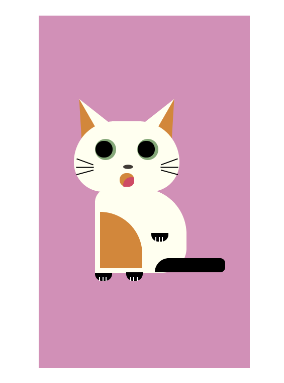
- HTML code
type or p<html>
    <head>
        <title> Kitty </title>
        <link rel = "stylesheet" href = "cat.css">
    </head>
    <body>
        <div class = "container">
            <div class = "cat">

                <div class = "face">
                    <div class = "left_ear">
                        <div class = "inner_left_ear"></div>
                    </div>
                    <div class = "right_ear">
                        <div class = "inner_right_ear"></div>
                    </div>
                    <div class = "left_eye">
                        <div class = "eyeball"></div>
                    </div>
                    <div class = "right_eye">
                        <div class = "eyeball"></div>
                    </div>

                    <div class = "whisker_1"></div>
                    <div class = "whisker_2"></div>
                    <div class = "whisker_3"></div>
                    <div class = "whisker_4"></div>
                    <div class = "whisker_5"></div>
                    <div class = "whisker_6"></div>

                    <div class ="nose"></div>
                    <div class="mouth">
                        <div class = "tongue"></div>
                    </div>
                </div>

                <div class = "body">
                    <div class = "left_paw">
                        <div class = "claw1"></div>
                        <div class = "claw2"></div>
                        <div class = "claw3"></div>
                    </div>
                    <div class = "right_paw">
                        <div class = "claw1"></div>
                        <div class = "claw2"></div>
                        <div class = "claw3"></div>
                    </div>
                    <div class = "side_arm">
                        <div class = "claw1"></div>
                        <div class = "claw2"></div>
                        <div class = "claw3"></div>
                    </div>
                    <div class = "tail"></div>
                    <div class = "tummy"></div>
                </div>
            </div>
        </div>
    </body>
</html>aste code here
- CSS code
.container {
    height: 500px;
    width: 300px;
    background-color: rgb(209, 144, 183);
    position: absolute;
    margin: auto;
    top: 0;
    bottom: 0;
    left: 0;
    right: 0;
    z-index: -1;
}

.cat {
    position:relative;
    top: 150px;
    left: 50px;
}

.face {
    background-color: ivory;
    height: 100px;
    width: 150px;
    border-radius: 70px 70px 50px 50px;
}

.left_ear, .right_ear{
    width: 0;
    height: 0;
    border-bottom: 50px solid ivory;
    border-left: 20px solid transparent;
    border-right: 20px solid transparent;
    position: relative;
    z-index: -1;
}

.left_ear {
    bottom: 35px;
    transform: rotate(-30deg);
}

.right_ear {
    bottom: 85px;
    left: 110px;
    transform: rotate(30deg);
}

.inner_left_ear {
    width: 0;
    height: 0;
    border-bottom: 50px solid #d2873b;
    border-left: 25px solid transparent;
    right: 25px;
    position: relative;
}

.inner_right_ear {
    width: 0;
    height: 0;
    border-bottom: 50px solid #d2873b;
    border-right: 25px solid transparent;
    position: relative;
}

.left_eye, .right_eye {
    background-color: rgb(133 168 121);
    height: 30px;
    width: 30px;
    border-radius: 50%;
    position: relative;
}

.left_eye {
    bottom: 75px;
    left: 30px;
}

.right_eye {
    bottom: 105px;
    left: 90px;
}

.eyeball {
    background-color: black;
    height: 24px;
    width: 24px;
    border-radius: 50%;
    position:relative;
    top: 3px;
    left: 1px;
}

.whisker_1{
    background-color: black;
    height: 25px;
    width: 1.5px;
    bottom: 150px;
    left: 15px;
    position: absolute;
    transform: rotate(-70deg);
}

.whisker_2{
    background-color: black;
    height: 25px;
    width: 1.5px;
    bottom: 142px;
    left: 15px;
    position: absolute;
    transform: rotate(-90deg);
}

.whisker_3{
    background-color: black;
    height: 25px;
    width: 1.5px;
    bottom: 135px;
    left: 15px;
    position: absolute;
    transform: rotate(-105deg);
}

.whisker_4{
    background-color: black;
    height: 25px;
    width: 1.5px;
    bottom: 150px;
    left: 135px;
    position: absolute;
    transform: rotate(70deg);
}

.whisker_5{
    background-color: black;
    height: 25px;
    width: 1.5px;
    bottom: 142px;
    left: 135px;
    position: absolute;
    transform: rotate(90deg);
}

.whisker_6{
    background-color: black;
    height: 25px;
    width: 1.5px;
    bottom: 135px;
    left: 135px;
    position: absolute;
    transform: rotate(105deg);
}

.nose {
    height: 24px;
    width: 30px;
    clip-path: ellipse(7px 3px at 7px 15px);
    background-color: #403b36;
    position: relative;
    bottom: 110px;
    left: 70px;
}

.mouth {
    position: relative;
    bottom: 110px;
    left: 65px;
    height: 19px;
    width: 21px;
    border-radius: 25px;
    background-color: #d2873b;
    z-index: 2;
  }

.tongue {
    position: relative;
    bottom: -6px;
    left: 5px;
    height: 13px;
    width: 16px;
    border-radius: 200px 50px 140px 25px;
    background-color: #ce4b65;
    z-index: 1;
}

.body {
    background-color: ivory;
    height: 120px;
    width: 130px;
    position: relative;
    left: 30px;
    bottom: 5px;
    border-radius: 20px 65px 35px 0;
}

.left_paw, .right_paw {
    background-color: black;
    height: 12px;
    width: 24px;
    position: relative;
    border-radius: 0 0px 10px 10px;
}

.left_paw {
    top: 120px;
}

.right_paw {
    top: 108px;
    left: 44px;
}

.side_arm{
    background-color: black;
    top: 40px;
    left: 80px;
    height: 12px;
    width: 24px;
    position: relative;
    border-radius: 0 0px 10px 10px;
}

.tail{
    background-color: black;
    width: 100px;
    height: 20px;
    position: relative;
    top: 64px;
    left: 85px;
    border-radius: 70px 25px 25px 0;
}

.tummy {
    background-color: #d2873b;
    height: 80px;
    width: 60px;
    position: relative;
    left: 7px;
    bottom: 22px;
    border-radius: 0 65px 0 0;
}

.claw1 {
    background-color: white;
    height: 6px;
    width: 1.5px;
    position: relative;
    top: 6px;
    left: 6px;
}

.claw2 {
    background-color: white;
    height: 6px;
    width: 1.5px;
    position: relative;
    top: 0px;
    left: 10.5px;
}

.claw3 {
    background-color: white;
    height: 6px;
    width: 1.5px;
    position: relative;
    top: -6px;
    left: 15px;
}
2 Likes
Below is My Code:
Honestly its more of a Copy paste (with just minor changes) 
(As my Interest is more in the Crypto Integration of the Dapp)
index.html
<html>
    <head>
        <link rel="stylesheet" href="style.css">
    </head>
    <body>
        <div class="cat">
            <div class="ears">
                <div class="ear left_ear">
                    <div class="inner_ear left_inner_ear">
                    </div>
                </div>
                <div class="ear right_ear">
                    <div class="inner_ear right_inner_ear">
                    </div>
                </div>

            </div>
            <div class="cat_tail"></div>
            <div class="cat_body"></div>
            <div id="face">
                <div class="eyes">
                    <div class="eye">
                        <div class="pupils">
                        </div>
                    </div>
                    <div class="eye">
                        <div class="pupils">
                        </div>
                    </div>
                </div>
                <div class="nose">

                </div>
                <div class="mouth"></div>
                <div class="whiskers"></div>
                <div class="paws">
                    <div class="left_back_paw"></div>
                    <div class="right_back_paw"></div>
                    <div class="left_front_paw"></div>
                    <div class="right_front_paw"></div>
                </div>
            </div>
        </div>
    </body>
</html>
style.css.
.cat{
    position: absolute;
    left: 50px;
    width: 250px;
}

.cat_tail{
    position: absolute;
    top: 300;
    background-color: rgb(169, 135, 26);
    border-radius: 50%;
    left: 160;
    width: 80px;
    height: 200px;
    transform-origin: right center;
    transform: rotate(59deg);
}

.cat_body{
    position: absolute;
    top: 159;
    background-color: rgb(206, 167, 41);
    border-radius: 50%;
    left: -25;
    width: 250px;
    height: 300px;
}

#face{
    position: absolute;
    background-color: rgb(223, 181, 46);
    width: 200px;
    height: 200px;
    border-radius: 50%;
}

.eyes{
    position: relative;
    top: 30px;
    display: flex;
}

.eye{
    background-color: white;
    border-radius: 50%;
    width: 50px;
    height: 50px;
    margin: 25px;
    position: relative;

}

.pupils{
    background-color: black;
    border-radius: 50%;
    width: 35px;
    height: 35px;
    position: absolute;
    top: 10px;
    left: 10px;

}

.ears{
    position: relative;
}

.ear{
    position: absolute;
    border-radius: 90% 0 90% 0;
    background-color: rgb(223, 181, 46);
    height: 100px;
    width: 100px;
}

.left_ear{
    transform: scale(1,-1);
    left: 0px;
}

.right_ear{
    left: 105px;
}

.inner_ear{
    position: relative;
    background-color: rgb(139, 108, 5);
    border-radius: 90% 0 90% 0;
    height: 80px;
    width: 80px;

}

.left_inner_ear{
    top: 15;
    left: 5px;
}

.right_inner_ear{
    left: 15px;
    top: 5;
}

.nose{
    background-color: rgb(139, 108, 5);
    border-radius: 10% 10% 80% 80%;
    width: 30px;
    height: 30px;
    left: 60;
    top: -20px;
    margin: 25px;
    position: relative;
}

.mouth{
    background-color: white;
    border-radius: 80% 80% 90% 90%;
    width: 60px;
    height: 20;
    left: 45;
    top: -30px;
    margin: 25px;
    position: relative;
}

.whiskers {
    content: '';
    width: 50%;
    height: 8px;
    position: absolute;
    bottom: 25%;
    left: 25%;
    transform-style: preserve-3d;
    perspective: 60px;
    }
.whiskers::before {
    content: '';
    position: absolute;
    top: -10;
    height: 100%;
    width: 35%;
    border: 2px solid black;
    border-left: none;
    border-right: none;
    right: 100%;
    transform-origin: right center;
    transform: rotateY(70deg) rotateZ(-10deg);
    }
.whiskers::after {
    content: '';
    position: absolute;
    top: -10;
    height: 100%;
    width: 35%;
    border: 2px solid black;
    border-left: none;
    border-right: none;
    left: 100%;
    transform-origin: left center;
    transform: rotateY(-70deg) rotateZ(10deg);
    }


  .left_front_paw{
    position: absolute;
    border-radius: 50%;
    background-color: rgb(223, 181, 46);
    height: 250px;
    width: 50px;
    left: 150px;
  }

  .right_front_paw{
    position: absolute;
    border-radius: 50%;
    background-color: rgb(223, 181, 46);
    height: 250px;
    width: 50px;
  }

  .right_back_paw{
    position: absolute;
    border-radius: 50%;
    background-color: rgb(169, 135, 26);
    height: 50px;
Thanks and Regards
Su.Kal Crypto
1 Like
Here’s my cat!
(for now)
HTML
<!DOCTYPE html>
<html lang="en">
<head>
  <meta charset="UTF-8">
  <title>Document</title>
  <link rel="stylesheet" href="cat_style2.css">
</head>
<body>

  <div id="cat">
    <div id="ears">
      <div class="ear left">
        <div class="inner_ear left"></div>
      </div>
      <div class="ear right">
        <div class="inner_ear right"></div>
      </div>
    </div>

    <div id="face">
      <div id="eyes">
        <div class="eye left">
          <div class="eyebrow left"></div>
          <div class="pupil left"><div class="inner_pupil left"></div></div>
        </div>
        <div class="eye right">
          <div class="eyebrow right"></div>
          <div class="pupil right"><div class="inner_pupil right"></div></div>
        </div>
      </div>

      <div id="face_body">
        <div class="face_body_background">
          <div id="nose"></div>
          <div id="mouth">
            <div id="mouthUpper"></div>
            <div id="mouthLowerRight"></div>
            <div id="mouthLowerLeft"></div>
          </div>
          <div id="hairs">
            <div class="hair left top"></div>
            <div class="hair left middle"></div>
            <div class="hair left bottom"></div>
            <div class="hair right top"></div>
            <div class="hair right middle"></div>
            <div class="hair right bottom"></div>
          </div>
        </div>
      </div>
    </div>

    <div id="body">
      <div id="core_body">
        <div class="body_pattern"></div>
      </div>
      <div id="feet">
        <div class="foot front left"></div>
        <div class="foot front right"></div>
        <div class="foot back left"></div>
        <div class="foot back right"></div>
      </div>
      <div id="tail"></div>
    </div>

  </div>

</body>
</html>
CSS
/**CAT MAIN****************************************/

body{
  position: relative;
}

#cat{
  position: absolute;
  left: 200px;
  top: 50px;
}

#ears, #face, #mouth, #nose, #hair, #body{
  position: absolute;
}

/**EARS****************************************/
#ears{
  position: relative;
  z-index: 0;
}

.ear{
  border-radius: 100% 10% 100% 0%;
  background-color: #C4A292;
  height: 100px;
  width: 70px;
  position: absolute;
}

.ear.right {
  left: 80px;
  top: -20px;
}

.ear.left {
  transform: scale(1,-1) rotate(180deg);
  bottom: -80px;
}

.inner_ear{
  border-radius: 90% 10% 90% 10%;
  background-color: #BE866C;
  height: 50px;
  width: 50px;
  position: absolute;
}

.inner_ear.right{
  left: 15px;
  top: 10px;
}

.inner_ear.left{
  left: 15px;
  top: 10px;
}

/**FACE****************************************/
#face{
  background-color: #9F826B;
  width: 150px;
  height: 130px;
  border-radius: 60% 60% 50% 50%;
  z-index: 1;
}

#eyes{
  position: relative;
  top: 30px;
  display: flex;
}

.eye{
  background-color: #788307;
  border-radius: 50%;
  width: 35px;
  height: 35px;
  border-radius: 60% 30% 60% 30%;
  position: relative;
  z-index: 1;
}

.eye.left{
  transform: scale(1,-1) rotate(10deg);
  left: 25px;
  top: 10px;
}

.eye.right{
  transform: rotate(10deg);
  left: 55px;
  top: 10px;
}

.pupil{
  background-color: #20110A;
  width: 25px;
  height: 30px;
  border-radius: 50%;
  position: absolute;
}

.pupil.left{
  top: 0px;
  left: 8px;
  transform: rotate(-25deg);
}

.pupil.right{
  top: 5px;
  left: 1px;
  transform: rotate(-25deg);
}

.inner_pupil{
  background-color: white;
  width: 10px;
  height: 5px;
  border-radius: 50%;
  position: absolute;
}

.inner_pupil.left{
  top: 15px;
  left: 3px;
  transform: rotate(15deg);
}

.inner_pupil.right{
  top: 10px;
  left: 3px;
  transform: rotate(15deg);
}

#face_body{
  position: relative;
  z-index: 0;
}

.face_body_background{
  position: absolute;
  background-color: #DDD0C9;
  border-radius: 50%;
  width: 100px;
  height: 60px;
  left: 25px;
  top: 30px;
}

#nose{
	width: 0;
	height: 0;
	border-left: 20px solid transparent;
	border-right: 20px solid transparent;
	border-top: 20px solid #D88485;
  border-radius: 50% 50% 0% 0%;
  position: absolute;
  left: 30px;
  top: 11px;
}

#mouth{
  position: relative;
}

#mouthUpper{
  position: absolute;
  width: 3px;
  height: 10px;
  background-color: black;
  left: 48.25px;
  top: 30px;
}

#mouthLowerRight{
  position: absolute;
  width: 3px;
  height: 12px;
  background-color: black;
  transform: rotate(-45deg);
  left: 52.25px;
  top: 38px;
}

#mouthLowerLeft{
  position: absolute;
  width: 3px;
  height: 12px;
  background-color: black;
  transform: rotate(45deg);
  left: 44.25px;
  top: 38px;
}

#hairs{
  position: relative;
}

.hair{
  width: 60px;
  border-top: 2.5px solid black;
  position: absolute;
  top:30px;
}

.hair.top.left{
  transform-origin: 70px 0px;
  transform: rotate(30deg);
  top: 30px;
}

.hair.bottom.left{
  transform-origin: 70px 0px;
  transform: rotate(-30deg);
}

.hair.top.right{
  transform-origin: -10px 2px;
  transform: rotate(30deg);
  top: 30px;
}

.hair.bottom.right{
  transform-origin: -10px 2px;
  transform: rotate(-30deg);
}

.hair.left{
  left: -40px;
}

.hair.right{
  left: 80px;
}

/**BODY****************************************/

#body{
  position: relative;
  z-index: 0;
}

#core_body{
  position: absolute;
  width: 180px;
  height: 70px;
  background-color: #9F826B;
  border-radius: 50% 70% 80% 100%;
  top: 120px;
  left: 30px;
  transform: rotate(8deg);
}

.body_pattern{
  position: absolute;
  width: 120px;
  height: 50px;
  background-color: #DDD0C9;
  border-radius: 80% 80% 80% 80%;
  top: 10px;
  left: 30px;
  transform: rotate(2deg);
  z-index: 3;
}

.foot{
  position: absolute;
  width: 30px;
  height: 80px;
  background-color: #C4A292;
  border-radius: 0% 0% 60% 60%;
}

.foot.front.right{
  top: 175px;
  left: 80px;
  height: 60px;
  z-index: 0;
  transform: rotate(5deg);
  border-radius: 20% 40% 60% 60%;
}

.foot.front.left{
  top: 150px;
  left: 40px;
  z-index: -1;
  transform: rotate(8deg);
}

.foot.back.right{
  top: 170px;
  left: 170px;
  height: 60px;
  transform: rotate(3deg);
  border-radius: 60% 40% 60% 60%;
  z-index: 0;
}

.foot.back.left{
  top: 170px;
  left: 140px;
  height: 60px;
  z-index: -1;
}

#tail{
  position: absolute;
  width: 100px;
  height: 23px;
  background-color: #DDD0C9;
  border-radius: 0% 50% 50% 0%;
  left: 160px;
  top: 120px;
  z-index: -1;
  transform: rotate(-50deg);
}
5 Likes
Nice! very original cat idea
Changed my mind
Common:

Rare:

(Took me hours to code! xD)
Here’s the code:
HTML
<div class="cat">
  <div class="cat__ears">
    <div class="cat__ear left">
      <div class="cat__ear_inside left"></div>
    </div>
    <div class="cat__ear right">
      <div class="cat__ear_inside right"></div>
    </div>
  </div>

  <div class="cat__head">
    <div class="cat__eyes">
      <div class="cat__eye left">
        <div class="cat__pupil left"><div class="cat__inner_pupil left"></div></div>
      </div>
      <div class="cat__eye right">
        <div class="cat__pupil right"><div class="cat__inner_pupil right"></div></div>
      </div>
    </div>

    <div class="cat__mouth_contour">
      <div class="cat__mouth_round left"></div>
      <div class="cat__mouth_round right"></div>
    </div>
    <div class="cat__nose">
      <div class="cat__inner_nose"></div>
    </div>

    <div class="cat__mouth">
      <div class="cat__tongue"></div>
    </div>

    <div class="cat__whiskers">
      <hr class="cat__whisker left top">
      <hr class="cat__whisker left middle">
      <hr class="cat__whisker left bottom">
      <hr class="cat__whisker right top">
      <hr class="cat__whisker right middle">
      <hr class="cat__whisker right bottom">
    </div>

    <div class="cat__face_lines">
      <hr class="cat__line_nose_to_mouth">
      <hr class="cat__face_line left">
      <hr class="cat__face_line right">
    </div>
  </div>

  <div class="cat__decoration">
    <div class="cat__ribbon"></div>
    <div class="cat__bell">
      <div class="cat__bell_dot"></div>
      <hr class="cat__bell_vertical_line">
      <hr class="cat__bell__horizontal_line_top">
      <hr class="cat__bell__horizontal_line_bottom">
    </div>
    <div class="cat__pocket"></div>
  </div>

  <div class="cat__body">
    <div class="cat__chest"></div>
    <div class="cat__inner_chest"></div>
  </div>

  <div class="cat__arms">
    <div class="cat__arm left">
      <div class="cat__hand left"></div>
    </div>
    <div class="cat__arm right">
      <div class="cat__hand right"></div>
    </div>
  </div>

  <div class="cat__feet">
    <div class="cat__feet_seperator"></div>
    <div class="cat__foot left"></div>
    <div class="cat__foot right"></div>
  </div>

</div>
CSS
*, *::before, *::after {
  margin: 0;
  padding: 0;
  box-sizing: inherit;
}
html {
  box-sizing: border-box;
  overflow-y: scroll;
}
body {
  background: #607d8b;
  position: relative;
}

.cat{
  position: absolute;
  left: 80px;
  top: 150px;
}

.cat *{
  outline-style: solid;
  outline-width: 1px;
  outline-color: black;
}

/**EARS****************************************/
 .cat__ears{
  position: relative;
  outline-style: none;
}

.cat__ear {
  background-color: #1DBEFE;
  position: absolute;
}

.cat__ear.right {
  border-radius: 20% 100% 0% 100%;
  height: 90px;
  width: 70px;
  transform: scale(1,-1) rotate(200deg);
  bottom: -80px;
  left: 80px;
}

.cat__ear.left {
  border-radius: 100% 20% 100% 0%;
  height: 90px;
  width: 70px;
  transform: scale(1,-1) rotate(160deg);
  bottom: -80px;
}

.cat__ear_inside{
  background-color: #FFFFFF;
  height: 80px;
  width: 60px;
  position: absolute;
}

.cat__ear_inside.right{
  border-radius: 20% 100% 0% 100%;
  top: 5px;
  left: 5px;
}

.cat__ear_inside.left{
  border-radius: 100% 20% 100% 0%;
  top: 5px;
  left: 5px;
}

/**HEAD****************************************/
.cat__head{
  position: relative;
  background-color: #1DBEFE;
  width: 150px;
  height: 150px;
  border-radius: 60% 60% 55% 55%;
  z-index: 0;
}

.cat__eyes{
  position: absolute;
  outline-style: none;
  top: 10px;
}

.cat__eye{
  position: absolute;
  background-color: #FFFFFF;
  width: 30px;
  height: 40px;
  border-radius: 60% 60% 60% 60%;
  z-index: 1;
}

.cat__eye.left{
  transform: scale(1,-1) rotate(10deg);
  left: 43.5px;
}

.cat__eye.right{
  transform: rotate(10deg);
  left: 75.5px;
}

.cat__pupil{
  background-color: #000000;
  width: 8px;
  height: 10px;
  border-radius: 60%;
  position: absolute;
  outline-style: none;
}

.cat__pupil.left{
  top: 12px;
  left: 18px;
  transform: rotate(-10deg);
}

.cat__pupil.right{
  top: 18px;
  left: 5px;
  transform: rotate(-10deg);
}

.cat__inner_pupil{
  background-color: white;
  width: 3px;
  height: 4px;
  border-radius: 50%;
  position: absolute;
}

.cat__inner_pupil.left{
  top: 3px;
  left: 3px;
  outline-style: solid;
}

.cat__inner_pupil.right{
  top: 3px;
  left: 2px;
  outline-style: none;
}

.cat__mouth_contour{
  position: absolute;
  background-color: #FFFFFF;
  width: 130px;
  height: 130px;
  border-radius: 60% 60% 55% 55%;
  top: 25px;
  left: 10px;
}

.cat__nose{
  position: absolute;
  width: 20px;
  height: 20px;
  border-radius: 50%;
  background-color: #D60035;
  z-index: 2;
  top: 43px;
  left: 65px;
}

.cat__inner_nose{
  position: absolute;
  width: 6px;
  height: 6px;
  border-radius: 50%;
  background-color: #FDFCFD;
  z-index: 2;
  top: 2px;
  left: 2.5px;
  outline-style: none;
}

.cat__mouth{
  position: absolute;
  height: 45px;
  width: 90px;
  border-radius: 15px 15px 45px 45px;
  background-color: #8A0004;
  left: 30px;
  top: 85px;
}


.cat__mouth_round{
  position: absolute;
  outline-style: none;
  width: 60px;
  height: 30px;
  border-radius: 0px 0px 25px 25px;
  background-color: #FFFFFF;
  z-index: 1;
}

.cat__mouth_round.left{
  left: 16px;
  top: 33px;
}

.cat__mouth_round.right{
  transform: scale(1,-1) rotate(180deg);
  left: 53px;
  top: 33px;
}

.cat__tongue{
  position: absolute;
  height: 30px;
  width: 65px;
  border-radius: 10px 10px 35px 35px;
  background-color: #FB0005;
  left: 12.5px;
  top: 15.5px;
  outline-style: none;
}

.cat__whiskers{
  position: absolute;
  outline-style: none;
  z-index: 3;
}

.cat__whisker{
  width: 40px;
  border: black;
  border-width: 0.85px;
  border-style: solid;
  position: absolute;
  top: 65px;
  outline-style: none;
}

.cat__whisker.top.left{
  transform-origin: 60px 0px;
  transform: rotate(25deg);
}

.cat__whisker.bottom.left{
  transform-origin: 60px 0px;
  transform: rotate(-15deg);
}

.cat__whisker.top.right{
  transform-origin: -20px 2px;
  transform: rotate(15deg);
}

.cat__whisker.bottom.right{
  transform-origin: -20px 2px;
  transform: rotate(-25deg);
}

.cat__whisker.left{
  left: 10px;
}

.cat__whisker.right{
  left: 100px;
}

.cat__face_lines{
  position: absolute;
  outline-style: none;
}

.cat__line_nose_to_mouth{
  position: absolute;
  border: black;
  border-width: 0.7px;
  border-style: solid;
  width: 21.5px;
  outline: none;
  transform: rotate(-90deg);
  top: 74px;
  left: 64px;
  z-index: 2;
}

.cat__face_line{
  position: absolute;
  outline-style: none;
  width: 60px;
  height: 160px;
  border: solid 1.2px #000;
  border-color: #000 transparent transparent transparent;
  border-radius: 140% 80% 0 0;
  z-index: 2;
}

.cat__face_line.left{
  position: absolute;
  top: -8px;
  left: 70px;
  transform: rotate(-90deg);
}

.cat__face_line.right{
  position: absolute;
  top: -8px;
  left: 20px;
  transform: scale(1, -1) rotate(90deg);
}

/**DECORATION****************************************/

.cat__decoration{
  position: relative;
  z-index: 10;
  outline: none;
}

.cat__ribbon{
  position: absolute;
  z-index: 10;
  width: 92px;
  height: 8px;
  border-radius: 20% 20% 30% 30%;
  background-color: #FB0006;
  top: -14px;
  left: 30px;
}

.cat__bell{
  position: absolute;
  z-index: 10;
  width: 20px;
  height: 20px;
  border-radius: 50%;
  background-color: #FFE737;
  left: 64px;
  top: -12px;
}

.cat__bell_dot{
  position: absolute;
  z-index: 11;
  width: 5px;
  height: 5px;
  border-radius: 50%;
  background-color: #9E2624;
  left: 7.25px;
  top: 10px;
}

.cat__bell_vertical_line{
  position: absolute;
  border: black;
  border-width: 0.9px;
  border-style: solid;
  width: 7px;
  outline: none;
  transform: rotate(-90deg);
  top: 16px;
  left: 5.9px;
  z-index: 2;
}

.cat__bell__horizontal_line_top{
  position: absolute;
  border: black;
  border-width: 0.8px;
  border-style: solid;
  width: 18px;
  outline: none;
  top: 4px;
  left: 1px;
  z-index: 2;
}

.cat__bell__horizontal_line_bottom{
  position: absolute;
  border: black;
  border-width: 0.8px;
  border-style: solid;
  width: 20px;
  outline: none;
  top: 7px;
  left: 0px;
  z-index: 2;
}

.cat__pocket{
  position: absolute;
  z-index: 10;
  width:50px;
  height:25px;
  border-radius:0 0 25px 25px;
  background:#FFFFFF;
  top: 20px;
  left: 50px;
}

/**BODY****************************************/
.cat__body{
  position: relative;
  outline-style: none;
}

.cat__chest{
  z-index: -1;
  position: absolute;
  width: 90px;
  height: 100px;
  background-color: #1DBEFE;
  border-radius: 30% 30% 0% 0%;
  top: -30px;
  left: 29.5px;
}

.cat__inner_chest{
  position: absolute;
  width: 75px;
  height: 65px;
  background-color: #FFFFFF;
  border-radius: 80% 80% 70% 70%;
  top: -10px;
  left: 37px;
  z-index: 2;
}

/**ARM****************************************/
.cat__arms{
  position: relative;
  outline-style: none;
}

.cat__arm{
  position: absolute;
  background-color: #1DBEFE;
  z-index: 1;
  height: 25px;
}

.cat__arm.left{
  position: absolute;
  width: 80px;
  height: 25px;
  border-radius: 80% 80% 80% 60%;
  transform: rotate(-40deg);
  left: -15px;
  top: 1px;
}

.cat__arm.right{
  position: absolute;
  width: 80px;
  border-radius: 100% 80% 80% 60%;
  transform: rotate(170deg);
  left: 90px;
  top: -15px;
}

.cat__hand{
  position: absolute;
  width: 25px;
  height: 25px;
  border-radius: 50%;
  background-color: #FFFFFF;
}

.cat__hand.right{
  position: absolute;
  left: -5px;
  top: 2px;
}

.cat__hand.left{
  position: absolute;
  left: -5px;
  top: 1px;
}

/**FEET****************************************/

.cat__feet{
  position: relative;
  outline-style: none;
}

.cat__feet_seperator{
  position: absolute;
  background-color: #607D8B;
  height: 13px;
  width: 25px;
  border-radius: 50% 50% 50% 50%;
  top: 62px;
  left: 62.5px;
  outline-style: none;
  z-index: 3;
}

.cat__foot{
  position: absolute;
  background-color: #FFFFFF;
  height: 16px;
  width: 42px;
  border-radius: 70% 50% 50% 50%;
  z-index: 4;
  top: 66.5px;
}

.cat__foot.left{
  left: 22px;
}

.cat__foot.right{
  transform: scale(-1,1);
  left: 86px;
}
7 Likes
Waaao this looks really amazing, a using CSS, sure its take you long tome to program it.
1 Like
Here is mine. Simple enough but I like it.
<html>

    <head>

        <link rel="stylesheet" href ="style.css">

    </head>

    <body>


        <div class="cat">


            <div id="chest">

                <div class="tail"></div>

            </div>


            <div class ="ears">

                <div class="ear left_ear"></div>

                <div class="ear right_ear"></div>

            </div>

            <div id="body">


                <div class ="eyes">

                    <div class="eye">

                        <div class="pupils">

                            <div class = "little_eyes"></div>

                        </div>

                    </div>


                    <div class="eye">

                        <div class="pupils">

                            <div class = "little_eyes"></div>

                        </div>

                    </div>

                </div>


            </div>

            <div class="nose"></div>


                    <div class="Top_facehair_right"></div>

                    <div class="Bottom_facehair_right"></div>

                    <div class="Top_facehair_left"></div>

                    <div class="Bottom_facehair_left"></div>

                    <div class="mouthleft"></div>

                    <div class="mouthright"></div>

                    <div class="paw_left"></div>

                    <div class="paw_right"></div>


        </div>

    </body>

</html>
#body{
    background-color: rgb(236, 236, 11);
    border: solid;
    width: 200px;
    height: 200px;
    border-radius: 50%;
    position: absolute;
}
.eyes{
    position: relative;
    top: 30px;
    display: flex;
}
.eye{
    background-color: white;
    border:solid;
    border-radius: 50%;
    width: 50px;
    height: 50px;
    margin: 25px;
    position:relative;
}
.pupils{
    background-color: black;
    width: 35px;
    height: 35px;
    border-radius: 50%;
    position: absolute;
    top: 13px;
    left: 8px;
}
.ears{
    position: absolute;
}
.ear{
    border-radius: 90% 0 90% 0;
    background-color: rgb(236, 236, 11);
    height: 100px;
    width: 100px;
    position: absolute;
    border: solid;
}
.left_ear{
    transform: scale(1,-1) rotate(
        24deg
        );
            left: 0px;
}
.right_ear{
    left: 100px;
}
#chest{
    border-radius: 50% 44% 30% 20%;
    border:solid;
    height: 150px;
    width: 150px;
    position: absolute;
    background-color: rgb(236, 236, 11);
    top: 166px;
    left: 30px;
}
.little_eyes{
    background-color: white;
    height: 12px;
    width: 12px;
    border-radius: 50%;
    position: absolute;
    top: 5px;
    left: 17px;
}
.tail{
    background-color: rgb(236, 236, 11);
    height: 77px;
    width: 69px;
    border-radius: 163% 1% 154% 0;
    position: absolute;
    left: 141px;
    top: 50px;
    border: solid;
}
.nose{
    background-color: black;
    height: 15px;
    width: 18px;
    border-radius: 72% 36% 42%;
    position: absolute;
    top: 124px;
    left: 98px;
}

.Top_facehair_right{
    background-color: black;
    height: 3px;
    width: 35px;
    border-radius: 0;
    position: absolute;
    top: 124px;
    left: 126px;
    transform: rotate(
-11deg
 );

}
.Bottom_facehair_right{
    background-color: black;
    height: 3px;
    width: 35px;
    border-radius: 0;
    position: absolute;
    top: 140px;
    left: 125px;
    transform: rotate(
8deg
 );
}
.Top_facehair_left{
    background-color: black;
    height: 3px;
    width: 35px;
    border-radius: 0;
    position: absolute;
    top: 122px;
    left: 53px;
    transform: rotate(
8deg
);
}
.Bottom_facehair_left{
    background-color: black;
    height: 3px;
    width: 35px;
    border-radius: 0;
    position: absolute;
    top: 140px;
    left: 54px;
    transform: rotate(
-12deg
);
}
.mouthleft{
    height: 20px;
    width: 25;
    border: solid;
    border-radius: 28% 0% 42% 47%;
    border-top: none;
    border-left: none;
    position: absolute;
    top: 133px;
    left: 79px;

}
.mouthright{
    height: 20px;
    width: 25px;
    border: solid;
    border-radius: 7% 0% 43% 47%;
    border-top: none;
    border-right: none;
    position: absolute;
    top: 134px;
    left: 106px;
}
.paw_left{
    background-color: rgb(196, 199, 40);
    border: solid;
    width: 39px;
    height: 79px;
    border-radius: 28px 28px 25px 25px;
    position: absolute;
    top: 256px;
    left: 49px;
    transform: rotate(
10deg
);
}
.paw_right{
    border:solid;
    background-color: rgb(196, 199, 46);
    width: 39px;
    height: 79px;
    border-radius: 28px 28px 25px 25px;
    position: absolute;
    top: 257px;
    left: 107px;
    transform: rotate(
170deg
);
}
1 Like
My cat
<html>
    <head>
        <link rel="stylesheet" href="styles.css">
    </head>
    <body>
        <div class= 'cat'>
            <div id='cat_body'>
                <div class= 'head'>
                    <div class= 'ears'>
                        <div class= 'rightear'>
                            <div class = 'innerear'></div>
                        </div>
                        <div class= 'leftear'>
                            <div class= 'innerear2'></div>
                        </div>
                    </div>
                    <div class= 'eyes'>
                        <div class = 'eye'>
                            <div class = 'pupil'></div>
                        </div>
                        <div class = 'eye'>
                            <div class = 'pupil'></div>
                        </div>
                    </div>
                    <div class= 'mouth'></div>
                    <div class= 'whisker'></div>
                    <div class= 'whisker2'></div>
                    <div class= 'whisker3'></div>
                    <div class= 'whisker4'></div>
                </div>
                <div class= 'body'>
                    <div class = 'neck'></div>
                    <div class = 'belly'></div>
                    <div class = 'legs'>
                        <div class = 'rightleg'></div>
                        <div class = 'leftleg'></div>
                    </div>
                    <div class='tail'></div>
                </div>
            </div>
        </div>
    </body>
</html>
css
.head {
    width:222px;
    height: 160px;
    background-color:gray;
    border-radius: 63px;
    margin-left: 50px;
    margin-top: 30px;
}

.ears{
    display: inline-flex;
    margin-block-start: -4px;
    margin-inline-start: 7px;
}
.rightear{
    width: 0;
    height: 0;
    border-top: 55px solid gray;
    border-right: 55px solid transparent;
    margin-right: 50px;
    transform: rotate(12deg);

}
.leftear{
    width: 0;
    height: 0;
    border-top: 55px solid gray;
    border-left: 55px solid transparent;
    margin-left: 50px;
    transform: rotate(-8deg);
}
.innerear{
    width: 0;
    height: 0;
    border-top: 27px solid black;
    border-right: 27px solid transparent;
    transform: rotate(3deg);
    margin-block-start: -50px;
    margin-inline-start: 6px;
}

.innerear2{
    width: 0;
    height: 0;
    border-top: 27px solid black;
    border-right: 27px solid transparent;
    transform: rotate(90deg);
    margin-block-start: -50px;
    margin-inline-start: -32px;
}
.eyes{
    width: 128px;
    height: 50px;
    display: inline-flex;

}
.eye{
    background-color: white;
    width: 44px;
    height: 44px;
    border-radius: 100px;
    margin:33px;
    margin-block-start: 10px;

}

.pupil{
    background-color: black;
    width: 30px;
    height: 30px;
    border-radius: 100px;
    margin-block-start: 10px;
    margin-inline-start: 10px;
}
.mouth{
    background-color: black;
    width: 55px;
    height: 16px;
    margin: auto;
    border-radius: 20px;
}
.whisker{
    width: 70px;
    height: 2px;
    background-color: black;
    margin-block-start: 3px;
    transform: rotate(-8deg);
}
.whisker2{
    width: 70px;
    height: 2px;
    background-color: black;
    margin-block-start: -9px;
    transform: rotateX(-8deg);
}

.whisker3 {
    width: 70px;
    height: 2px;
    background-color: black;
    margin-block-start: 3px;
    margin-left: 152px;
    transform: rotate(8deg);
}
.whisker4{
    width: 70px;
    height: 2px;
    background-color: black;
    margin-block-start: -9px;
    margin-left: 151px;
    transform: rotateX(-8deg);
}
.body {
    width:200px;
    height: 150px;
    background-color:gray;
    margin-left: 81px;
    border-top-right-radius: 65px;
    border-bottom-right-radius: 10px;
    border-top-left-radius: 45px;

}
.neck {
    width: 110px;
    height: 21px;
    border-radius: 8px 8px 46px 46px;
    background-color: black;
    margin-left: 30px;
}
.legs{
    width: 100px;
    height: 50px;
    display: inline-flex;
    margin-top: -12px;

}
.leftleg{
    background-color: grey;
    width: 40px;
    height: 30px;
    border-radius: 100px;
    margin-left: 20px;
}
.rightleg{
    background-color:grey;
    width: 40px;
    height: 30px;
    border-radius: 100px
}
.tail{
    background-color:grey;
    height: 10px;
    width: 75px;
    margin-top: -56px;
    margin-inline-start: 200px;
    border-bottom-right-radius: 10px;
    border-top-right-radius: 10px;
    position: relative;
}

.belly{
    height: 130px;
    width: 80px;
    border-radius: 33px 40px 0px 0px;
    background-color: blanchedalmond;
    margin-left: 26px;
}
Here is a version for my crypto kitties. I wanted to create the cats in Photoshop but I was not sure if that would have given me more problems. I might try that if I have time later down the road.
index
<html>

  <head>
    <link rel="stylesheet" href="style.css">
  </head>
    <body>
      <div class="cat_loc">

          <div id="head">
            <div class="eyesParent">
              <div class="eye">
                <div class="pupils">
                  <div class="ref"></div>
                </div>
              </div>
              <div class="eye">
                <div class="pupils">
                  <div class="ref"></div>
                </div>
              </div>
          </div>

          <div class="earsParent">
            <div class="earShape left_ear"></div>
            <div class="earShape right_ear"></div>
          </div>


          <div class="mouthParent">
            <div class="left_mouth">
              <div class="cheek">
                <div class="whiskers1"></div>
                <div class="whiskers2"></div>
                <div class="whiskers3"></div>
              </div>
            </div>

            <div class="nose"></div>


            <div class="right_mouth">
              <div class="cheek">
                <div class="whiskers1"></div>
                <div class="whiskers2"></div>
                <div class="whiskers3"></div>
              </div>
            </div>

          </div>

          </div>

          <div class="body">
            <div class="chest"></div>

            <div class="pattern_Parent">
              <div class="patternLt">
                <div class="patternShapeL1"></div>
                <div class="patternShapeL2"></div>
                <div class="patternShapeL3"></div>
              </div>

              <div class="patternRt">
                <div class="patternShapeR1"></div>
                <div class="patternShapeR2"></div>
                <div class="patternShapeR3"></div>
              </div>

            </div>

                <div class="hindLegsParent">
                  <div class="left_hindLegs">
                    <div class="hindLegsShape"></div>
                  </div>
                  <div class="right_hindLegs">
                    <div class="hindLegsShape"></div>
                  </div>
                </div>

                <div class="front_legs_Parent">
                  <div class="leg frontLegs_left">
                    <div class="front_pawsL">
                      <div class="pawL"></div>
                    </div>
                  </div>

                  <div class="leg frontLegs_rt">
                    <div class="front_pawsR">
                      <div class="pawR"></div>
                    </div>
                  </div>
                </div>
              </div>

          <div class="tail"></div>
      </div>


    </body>
</html>
style.css
.cat_loc{
  position: relative;
  top: 20px;
  left: 20px;
}


#head{
  background-color: rgb(136, 150, 150);
  width: 200px;
  height: 200px;
  border-radius: 50%;
}
.eyesParent{
  position: relative;
  top: 30px;
  display: flex;
}

.eye{
  background-color: azure;
  border-radius: 50%;
  width: 50px;
  height: 50px;
  margin: 25px;
  position: relative;
}

.pupils{
  background-color: black;
  width: 32px;
  height: 32px;
  border-radius: 50%;
  position: absolute;
  top: 10px;
  left: 10px;
}

.ref{
  background-color: rgb(234, 240, 245);
  width: 10px;
  height: 10px;
  border-radius: 50%;
  position: absolute;
  top: 1px;
  left: 21px;
}

.earsParent{
  position: relative;
  z-index: -1;
}
.earShape{
  border-radius: 90px 0px 90px 0px;
  background-color: rgb(121, 151, 151);
  height: 130px;
  width: 100px;
  position: absolute;
}
.left_ear{
  transform: scale(1, -1) rotate(-2deg);
  left: 0;
  top: -106px;
}
.right_ear{
  left: 100px;
  top: -106px;
}

.nose{
  background-color: rgb(138, 90, 160);
  width: 33px;
    height: 34px;
    border-radius: 10% 40% 50% 40%;
    position: absolute;
    top: 3px;
    left: 83px;
    transform: rotate(224deg);
}

.mouthParent{
  width: 89px;
  height: 61px;
  position: relative;
}

.left_mouth{
  position: absolute;
  left: -1px;
  top: 1px;
}

.right_mouth{
  position: absolute;
  left: 157px;
  top: 29px;
  transform: rotate(-186deg);
}

.cheek{
  background-color: #a5bba5;
  width: 45px;
  height: 42px;
  border-radius: 50%;
  position: relative;
  left: 53px;
  top: 17px;

}

.whiskers1{
  background-color: #232323;
  width: 60px;
  height: 3px;
  position: relative;
  left: -46px;
  top: 10px;
  transform: rotate(
    8deg
    );
}

.whiskers2{
  background-color: #232323;
  width: 60px;
  height: 3px;
  position: relative;
  left: -46px;
  top: 16px;
  transform: rotate(3deg);
}

.whiskers3{
  background-color: #232323;
  width: 60px;
  height: 3px;
  position: relative;
  left: -46px;
  top: 26px;
  transform: rotate(-186deg);
}

.body{
  background-color: rgb(136, 150, 150);
  width: 220px;
  height: 259px;
  border-radius: 30% 49% 30% 50%;
  position: absolute;
  top: 162px;
  left: 14px;
  z-index: -1;
}

.chest{
  background-color: rgb(220, 233, 233);
  width: 120px;
  height: 159px;
  border-radius: 30% 50% 30% 50%;
  position: absolute;
  top: 104px;
  left: 58px;
}

.pattern_Parent{
  position: relative;
  z-index: 1;
}

.patternLt{
  position: absolute;
}
.patternRt{
  position: absolute;
  transform: scaleX(-1);
  right: 29px;
}

.patternShapeL1{
  background-color: rgb(122, 190, 31);
  width: 41px;
  height: 16px;
  position: absolute;
  border-radius: 5% 70% 70% 5%;
  transform: rotate(47deg);
  top: 24px;
  left: 20px;
}

.patternShapeL2{
  background-color: rgb(122, 190, 31);
  width: 41px;
  height: 16px;
  position: absolute;
  border-radius: 5% 70% 70% 5%;
  transform: rotate(47deg);
  top: 55px;
  left: 2px;
}

.patternShapeL3{
  background-color: rgb(122, 190, 31);
  width: 34px;
  height: 13px;
  position: absolute;
  border-radius: 5% 70% 70% 5%;
  transform: rotate(15deg);
  top: 95px;
  left: 2px;
}

.patternShapeR1{
  background-color: rgb(122, 190, 31);
  width: 41px;
  height: 16px;
  position: absolute;
  border-radius: 5% 70% 70% 5%;
  transform: rotate(47deg);
  top: 24px;
  left: 20px;
}

.patternShapeR2{
  background-color: rgb(122, 190, 31);
  width: 41px;
  height: 16px;
  position: absolute;
  border-radius: 5% 70% 70% 5%;
  transform: rotate(47deg);
  top: 55px;
  left: 2px;
}

.patternShapeR3{
  background-color: rgb(122, 190, 31);
  width: 34px;
  height: 13px;
  position: absolute;
  border-radius: 5% 70% 70% 5%;
  transform: rotate(15deg);
  top: 95px;
  left: 2px;
}


.hindLegsParent{
  position: absolute;
}

.left_hindLegs{
  left: 0px;
}
.right_hindLegs{
  left: 0px;
}

.hindLegsShape{
  background-color: rgb(136, 150, 150);
  width: 130px;
  height: 143px;
  border-radius: 30% 50% 30% 50%;
  position: absolute;
  top: 121px;
  left: 128px;
  z-index: -1;
}


.tail{
  background-color: rgb(57, 128, 128);
  width: 169px;
  height: 43px;
  border-radius: 99% 42% 91% 21%;
  position: relative;
  top: 170px;
  left: 168px;
  z-index: -2;
}

.front_legs_Parent{
  position: relative;
  top: 30px;
}

.leg{
  background-color: rgb(136, 150, 150);
  width: 66px;
  height: 245px;
  border-radius: 30%;
  position: absolute;
}

.frontLegs_lft{
  left: 10px;
}

.frontLegs_rt{
  left: 123px;
}


.front_pawsR{
  background-color: rgb(197, 206, 206);
  width: 66px;
  height: 65px;
  border-radius: 47% 33% 46% 27%;
  position: relative;
  top: 200;
}

.front_pawsL{
  background-color: rgb(197, 206, 206);
  width: 66px;
  height: 65px;
  border-radius: 47% 33% 46% 27%;
  position: relative;
  top: 200;
}
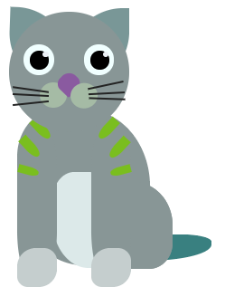
3 Likes
cat CODE
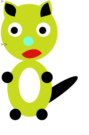
<html>
    <head>
        <link rel="stylesheet" href="style.css">
    </head>>
<body>

    <div class="cat">
        <div class="ears">
        <div class="ear Left_ear"></div>
        <div class="ear Right_ear"></div>

        </div>


        <div id="catHead">
            <div class="eyes">
            <div class="eye">
                <div class="pupils"></div>
            </div>

            <div class="eye">
                <div class="pupils"></div>
            </div>

            <div class="HeadStripe1"></div>
            <div class="HeadStripe2"></div>
         </div>

     <div id="catNose">
        <div class="catWhiskers"></div>
        <div class="catWhiskers1"></div>
    </div>
        <div id="catBody">
        <div class="bellyPatch"></div>
        <div class="RightPaw"></div>
        <div class="LeftPaw"></div>
        <div class="BottomLeftPaw"></div>
        <div class="BottomRightPaw"></div>

     </div>
</body>>

</html>>
#catHead{
    background-color: rgb(199, 218, 29);
    width: 200px;
    height: 200px;
    border-radius: 60%;


}

.HeadStripe1{
    border-radius: 157% 0 27% 0;
    background-color: rgb(0, 0, 0);
    height: 43px;
    width: 38px;
    position: absolute;
    transform: rotate(345deg);
    top: -41px;
    left: 135px;
}
.HeadStripe2{
    border-radius: 59% 0 72% 0;
    background-color: rgb(0, 0, 0);
    height: 43px;
    width: 38px;
    position: absolute;
    transform: rotate(825deg);
    top: -41px;
    left: 14px;

}


.eyes{
    position: relative;
    top: 40px;
    display: inline-flex;
}
.eye{
    background-color: rgb(255, 255, 255);
    border-radius: 50%;
    width: 50px;
    height: 50px;
    margin: 25px;
    position: relative;

}

.pupils{
    background-color: rgb(2, 7, 7);
    border-radius: 50%;
    width: 25px;
    height: 25px;
    top: 15px;
    left: 10px;
    position: absolute;

}

.ears{
    position: relative;

}

.left_ear{
    border-radius: 90% 0 90% 0;
    background-color: rgb(199, 218, 29);
    height: 100px;
    width: 100px;
    position: absolute;
    transform: rotate(106deg);

}

.Right_ear{
    border-radius: 90% 0 90% 0;
    background-color: rgb(199, 218, 29);
    height: 100px;
    width: 100px;
    position: absolute;
    left: 92px;
    transform: rotate(161deg);


}

#catNose{
    border-radius: 55%;
    background-color: aquamarine;
    height: 33px;
    width: 36px;
    top: 14px;
    right: -79px;
    position: relative;

}

.catWhiskers{
    background-color: black;
    border-radius: 50%;
    height: 214px;
    width: 40px;
    position: absolute;
    top: 94px;
    left: 83px;
    transform: rotate(56deg);

}

.catWhiskers1{
    background-color: #da1313;
    border-radius: 90% 0 90% 0;
    height: 59px;
    width: 40px;
    position: absolute;
    top: 31px;
    left: 10px;
    transform: rotate(-126deg);

}


#catBody{
    background-color: rgb(199, 218, 29);
    border-radius: 100%;
    height: 200px;
    width: 157px;
    position: absolute;
    top: 221px;
    left: 31px;

}

.bellyPatch{
    background-color: rgb(255, 255, 255);
    border-radius: 50%;
    height: 123px;
    width: 76px;
    position: relative;
    top: 28px;
    left: 40px;

}

.RightPaw{
    background-color: black;
    border-radius: 50%;
    height: 40px;
    width: 40px;
    top: 21%;
    left: -20px;
    position: absolute;
}


.LeftPaw{
    background-color: black;
    border-radius: 50%;
    height: 40px;
    width: 40px;
    top: 21%;
    left: 120px;
    position: absolute;
}

.BottomRightPaw{
    background-color: black;
    border-radius: 50%;
    height: 40px;
    width: 40px;
    top: 86%;
    left: 8px;
    position: absolute;
}

.BottomLeftPaw{
    background-color: black;
    border-radius: 50%;
    height: 40px;
    width: 40px;
    top: 86%;
    left: 102px;
    position: absolute;
}
2 Likes
Hi guys,
here is a version of my crypto kitty:
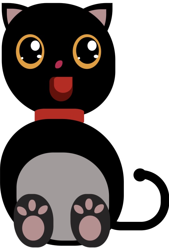
HTML:
<html>
    <head>
        <link rel="stylesheet" href="style.css">
    </head>
<body>
    <div class="cat">
        <div class="tail"></div>
        <div class="tail-mask"></div>
        <div class="tail-end"></div>
        <div class="ears">
             <div class="ear left_ear">
                 <div class="inner_ear left_inner_ear"></div>
            </div>
             <div class="ear right_ear">
             <div class="inner_ear right_inner_ear"></div>
               </div>
    <div id="body">
        <div class="eyes">
            <div class="eye">
                <div class="pupils">
                    <div class="inner_eye_big"></div>
                    <div class="inner_eye_small"></div>
                    <div class="inner_eye_smallest"></div>
                </div>
            </div>
            <div class="eye">
                <div class="pupils">
                    <div class="inner_eye_big"></div>
                    <div class="inner_eye_small"></div>
                    <div class="inner_eye_smallest"></div>
                </div>
            </div>
            </div>
            <div class="nose"></div>
            <div class="mouth">
                <div class="tongue"></div>
            </div>
            <div class="chain"></div>
            <div class="cat_body"></div>
            <div class="belly"></div>
            <div class="feet">
                <div class="foot">
                    <div class="inner_foot_small1"></div>
                    <div class="inner_foot_small2"></div>
                    <div class="inner_foot_small3"></div>
                    <div class="inner_foot_big"></div>
                </div>
                <div class="foot">
                    <div class="inner_foot_small4"></div>
                    <div class="inner_foot_small5"></div>
                    <div class="inner_foot_small6"></div>
                    <div class="inner_foot_big"></div>
                </div>
            </div>
        </div>
</div>
</body>

</html>
CSS:
#body{

    background-color: black;
    width: 200px;
    height: 200px;
    border-radius:40% 50% 40% 50%;
    position:absolute;
}

.eyes{
    position: relative;
    top: 30px;
    display: flex;
}
.eye{
    background-color: rgb(235, 155, 35);
    border-radius: 50%;
    width: 50px;
    height: 61px;
    margin:25px;
    position:relative;
}

.pupils{
    background-color: black;
    border-radius: 50%;
    width: 40px;
    height: 47px;
    position: absolute;
    top: 5px;
    left: 6px;
}

.inner_eye_big{
    background-color: white;
    width: 16px;
    height: 18px;
    border-radius: 50%;
    position: absolute;
    top: 6px;
    left: 20px;
}

.inner_eye_small{
    background-color: white;
    width: 8px;
    height: 6px;
    border-radius: 50%;
    position: absolute;
    top: 31px;
    left: 31px;
}

.inner_eye_smallest{
    background-color: white;
    width: 4px;
    height: 4px;
    border-radius: 50%;
    position: absolute;
    top: 35px;
    left: 3px;
}

.ears{
    position: relative;
}

.ear{
    border-radius:90% 0 90% 0;
    background-color: black;
    height: 100px;
    width: 100px;
    position: absolute;
}

.left_ear{
    left: 0px;
    transform: scale(-1,1);

}

.right_ear{
    left: 95px;

}

.inner_ear{
    position: relative;
    background-color: rosybrown;
    border-radius: 90% 0 90% 0;
    height: 80px;
    width: 80px;
}

.left_inner_ear{
    top: 10px;
    left: 11px;
}

.right_inner_ear{
    left: 9px;
    top: 11px;
}

.nose{
    background-color: rgb(194, 23, 80);
    border-radius: 80% 30% 80% 30%;
    height: 14px;
    width: 13px;
    top: -10px;
    position: relative;
    left: 94px;
}

.mouth{
    background-color: rgb(109, 3, 3);
    border-radius: 20% 00% 50% 50%;
    height: 43px;
    width: 41px;
    top: 5px;
    position: relative;
    left: 84px;
}

.tongue{
    background-color: rgb(196, 23, 23);
    border-radius: 20% 0% 50% 50%;
    height: 28px;
    width: 32px;
    top: 0px;
    position: relative;
    left: 8px;
}

.chain{
    background-color: rgb(196, 23, 23);
    border-radius: 20%;
    height: 28px;
    width: 87px;
    top: 18px;
    position: relative;
    left: 58px;
}

.belly{
    background-color: rgb(162 155 155);
    width: 163px;
    height: 155px;
    border-radius: 40% 50% 40% 50%;
    position: relative;
    top: -156px;
    left: 26px;
}
.cat_body{
    background-color: black;
    width: 218px;
    height: 223px;
    border-radius: 40% 50% 40% 50%;
    position: relative;
    top: 8px;
    left: -3px;
}
.tail {
    position: absolute;
    margin-left: 40px;
    margin-top: 40px;
    height: 76px;
    width: 105px;
    border: 15px solid #000000;
    border-radius: 50px;
    display: inline-block;
    z-index: 0;
    top: 262px;
    left: 128px;
  }

  .tail-mask {
    position: absolute;
    margin-top: 40px;
    margin-left: 100px;
    height: 30px;
    width: 76px;
    background-color: #ffffff;
    z-index: 0;
    top: 255px;
    left: 72px;
  }

  .tail-end {
    position: absolute;
    margin-top: 63px;
    margin-left: 130px;
    height: 23px;
    width: 23px;
    border-radius: 50%;
    background-color: #000000;
    z-index: 1;
    top: 236px;
    left: 110px;
  }

  .feet{
    position: relative;
    display: flex;
  }

  .foot{
    background-color: #292527;
    width: 155px;
    height: 94px;
    border-radius: 40% 50% 40% 50%;
    position: relative;
    top: -253px;
    left: 6px;
    margin: 15px;
  }

  .inner_foot_small1{
    background-color: rosybrown;
    width: 17px;
    height: 16px;
    border-radius: 20% 80% 20% 80%;
    position: absolute;
    top: 22px;
    left: 6px;
  }
  .inner_foot_small2{
    background-color: rosybrown;
    width: 13px;
    height: 20px;
    border-radius: 80%;
    position: absolute;
    top: 10px;
    left: 26px;
  }
  .inner_foot_small3{
    background-color: rosybrown;
    width: 17px;
    height: 16px;
    border-radius: 80% 20% 80% 20%;
    position: absolute;
    top: 20px;
    left: 43px;
  }
  .inner_foot_small4{
    background-color: rosybrown;
    width: 17px;
    height: 16px;
    border-radius: 20% 80% 20% 80%;
    position: absolute;
    top: 19px;
    left: 6px;
  }
  .inner_foot_small5{
    background-color: rosybrown;
    width: 13px;
    height: 20px;
    border-radius: 80%;
    position: absolute;
    top: 8px;
    left: 26px;
  }
  .inner_foot_small6{
    background-color: rosybrown;
    width: 17px;
    height: 16px;
    border-radius: 80% 20% 80% 20%;
    position: absolute;
    top: 18px;
    left: 42px;
  }

  .inner_foot_big{
    background-color: rosybrown;
    width: 39px;
    height: 44px;
    border-radius: 80%;
    position: absolute;
    top: 38px;
    left: 15px;

  }
4 Likes
So for my project, I forked and did Crypto Dogs instead.
My code:
<html>
<head>
<link rel="Stylesheet" href="style.css">
</head>
<body>
<div class="dog">
<div class="ears">
<div class="ear left_ear"></div>
<div class="ear right_ear"></div>
</div>
</div>
    <div id="body">
    <div class="tail"></div>
        <div class="dog_body">

        </div>
    <div class="face">
        <div class="eyes">
        <div class="eye">
        <div class="pupils"></div>
        </div>
         <div class="eye">
        <div class="pupils"></div>
        </div>
        </div>
        <div class="nose"></div>
        <div class="mouth">
        <div class= "spots"></div>
        <div class="spots_two"></div>
        <div class="spot"></div>

        <div class="whiskers"></div>
        </div>
                <div class="paws">
                    <div class="left_back_paw"></div>
                    <div class="right_back_paw"></div>
                    <div class="left_front_paw"></div>
                    <div class="right_front_paw"></div>
                </div>
        </div>
        </div>

    </div>
</body>


</html>
CSS:
.dog{
    position: absolute;
    left:50px;
    width:250px;

}

.face{
background-color: rgb(0, 255, 200);
width: 200px;
border-radius: 50%;
height:200px;
}
.eyes{
    position: relative;
    top:30px;
    display: flex;
    margin:35%
}
.eye{
    background-color: white;
    border-radius: 50%;
    width: 50px;
    height: 50px;
    position: relative;


}
.pupils{
    background-color: black;
    border-radius: 50%;
    width: 35%;
    height: 27%;
    position: absolute;
    top: 17px;
    left: 9px
}


.ears{
    position:relative;
}
.ear{
    border-radius: 90% 0 90% 0;
    background-color: rgb(0, 255, 200);
    height:100px;
    width:100px;
    position:absolute;


}
.left_ear{
transform: scale(1,-1) rotate(0deg);
left:10;
}
.right_ear{
    left: 10px;
}
#body{
    width:550px;
    height:880px;
    border-radius: 87%;
    position: relative;
}
.dog_body{
    position: absolute;
    top: 158;
    background-color:rgb(0, 255, 200);
    border-radius: 50%;
    left: -35;
    width: 280px;
    height: 200px;
}

.mouth{
    background-color: white;
    border-radius: 80% 80% 90% 90%;
    width: 60px;
    height: 20;
    left: 45;
    top: -30px;
    margin: 25px;
    position: relative;
}
.whiskers {

    width: 50%;
    height: 88px;
    position: absolute;
    bottom: 5%;
    left: 25%;
    transform-style: preserve-3d;
    perspective: 60px;
    }
.whiskers::before {
    content: '';
    position: absolute;
    top: -41;
    height: 100%;
    width: 35%;
    border: 2px solid black;
    border-left: none;
    border-right: none;
    right: 100%;
    transform-origin: right center;
    transform: rotateY(70deg) rotateZ(-10deg);
    }
.whiskers::after {
    content: '';
    position: absolute;
    top: -41;
    height: 100%;
    width: 35%;
    border: 2px solid black;
    border-left: none;
    border-right: none;
    left: 100%;
    transform-origin: left center;
    transform: rotateY(-70deg) rotateZ(10deg);
    }


  .left_front_paw{
    position: absolute;
    border-radius: 50%;
    background-color: rgb(0,255,200);
    height: 250px;
    width: 50px;
    left: 150px;
  }
  .spots{
    background-color: white;
    border-radius: 80% 80% 90% 90%;
    width: 20px;
    height: 20;
    left: 4;
    top: 80px;
    margin: 5px;
    position: relative;
  }
  .spots_two{
    background-color: white;
    border-radius: 80% 80% 90% 90%;
    width: 40px;
    height: 20;
    left: 10;
    top: 80px;
    margin: 5px;
    position: relative;
  }
  .spot{
    background-color: white;
    border-radius: 80% 80% 90% 90%;
    width: 30px;
    height: 20;
    left: 48;
    top: 35px;
    margin: 5px;
    position: relative;
  }

  .right_front_paw{
    position: absolute;
    border-radius: 50%;
    background-color: rgb(0,255,200);
    height: 250px;
    width: 50px;
  }
  .tail{
    position: absolute;
    top: 300;
    background-color: black;
    border-radius: 50%;
    left: 160;
    width: 80px;
    height: 100px;
    transform-origin: right center;
    transform: rotate(59deg);
}
.nose{
    background-color: rgb(139, 108, 5);
    border-radius: 10% 10% 80% 80%;
    width: 30px;
    height: 30px;
    left: 60;
    top: -20px;
    margin: 25px;
    position: relative;
}
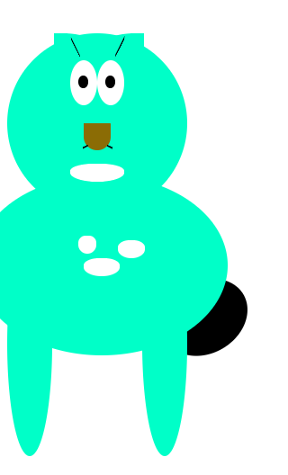
1 Like