Balance Component exercise

Gitignore: I usually google something like “react project .gitignore” and take a solid result, then add my own needs if there are any. See: https://github.com/facebook/react/blob/master/.gitignore.

package-lock.json should not be in .gitignore. This is a very common question. Googling “package-lock.json gitignore” gives you a StackOverflow question, where you can see more than a thousand upvotes and a detailed explanation: https://stackoverflow.com/questions/44206782/do-i-commit-the-package-lock-json-file-created-by-npm-5. The thought process normally makes sense that an automatically generated file should not be in source control. But exceptions apply, and package-lock.json is one.

2 Likes

edit

1 Like

AccountBalance.jsx

import React, { Component } from 'react';
import PropTypes from 'prop-types';
import './AccountBalance.css';

export default class AccountBalance extends Component {
    render() {
        return (
            <div className="accountBalance">
             <strong> Balance: ${this.props.amount} </strong>
            </div>
        );
    }
}


AccountBalance.propTypes = {
    amount: PropTypes.number.isRequired
}

AccountBalance.css

.accountBalance {
    text-align: center;
    font-size: 2rem;
    color: white;
    margin-top: 20px;
}

image

1 Like
  • AccountBalance.jsx
import './AccountBalance.css';

export default class AccountBalance extends Component {
    static propTypes = {
        prop: PropTypes
    }

    render() {
        return (
            <section className="AccountBalance">
             ${this.props.amount}   
            </section>
        );
    }
}
  • AccountBalance.css
.AccountBalance{
    color: rgba(197, 43, 211, 0.767);
    font-size: 30px;
    text-align: center;
    margin: 30px 30px;
}
1 Like

image

image

1 Like

My AccountBalance.css looks like this:

.balance {
    text-align: center; 
    color: rgb(81, 227, 253);
    font-size: 2.2rem;
    font-weight: 700;
}

Here I imported it in AccountBalance.jsx:

import './AccountBalance.css'

As well as gave the section a className:

<section className='balance'>
          $ {this.props.amount}
</section>

This gives my balance a look like this:

image

2 Likes

JSX

render(){
return(
<section className="account balance">
Your Balance is : {this.state.currency}{this.state.amount}
</section>
)}

CSS

.accountBalance {
text-align:center;
color:red;
font-size:2rem;
margin-top: 20px;
}
1 Like

.jsx

import React, { Component } from 'react';
import './AccountBalance.css'
import propTypes from 'prop-types';

export default class AccountBalance extends Component {
    render() {
        return (
            <section>
                Account Balance: <span>${this.props.amount}</span>
            </section>
        );
    }
}

AccountBalance.propTypes = {
    amount: propTypes.number.isRequired
}

.css

section {
    font-size: 2rem;
    font-weight: bold;
}

span {
    color: rgb(12, 105, 12);
}

2 Likes

AccountBalance.jsx

import React, { Component } from 'react';

import './AccountBalance.css';

import PropTypes from 'prop-types';

export default class AccountBalance extends Component {

    render() {

        return (

            <section className="account-balance">

              Account Balance: $ {this.props.amount}  

            </section>

        );

    }

}

AccountBalance.css

.account-balance {

    margin: 20px auto 10px auto;

    border: 1px solid #cccccc;

    width: 40vh;

}

Result

2 Likes

JSX:

import './AccountBalance.css'
import React, { Component } from 'react'
import PropTypes from 'prop-types'

export default class AccountBalance extends Component {        
    render() {
        return (
            <div id="balance">
              Balance: ${this.props.amount}  
            </div>
        )
    }
}

AccountBalance.propTypes = {
amount: PropTypes.number.isRequired
}

CSS:

#balance {
background-color: rgb(31, 32, 34);
font-size: 1.5rem;
font-weight: 700;
padding: 5px;
}

1 Like

the .jsx:

export default class AccountBalance extends Component {

render() {

    return (

        <section className="balance-output">

         $ {this.props.amount}   

        </section>

    );

}

}

from the .css:

.balance-output {

width: 24vh;

font-stretch: expanded;

}

1 Like
section {
    border: 1px solid #cccccc;
    width: 35vh;
    margin: auto;
    font-size: 30px;
    color: rgba(255, 123, 0, 0.712);
}
1 Like

AccountBalance.jsx

import React, { Component } from 'react';
import PropTypes from 'prop-types';
import './AccountBalance.css';

export default class AccountBalance extends Component {
    render() {
        return (
            <section className="balance">
                <center>Account Remaining Balance: ${this.props.amount}</center>
            </section>
        ); 
    }
}

AccountBalance.propTypes = {
   amount: PropTypes.number.isRequired
}

AccountBalance.css

.balance {
    display: flexbox;
    justify-content: center;
    margin: 24px 23px;
    color: rgb(94, 255, 0);
    font-weight: bold;
    font-size: 2rem;
    padding: 2rem;
    border: 2px solid #020202;
}

Outcome:

1 Like

AccountBalance.css:

.account-balance {
    margin: 10px auto 10px auto;
}
import './AccountBalance.css';
...
...
<section className="account-balance">
                Account Balance: $ { this.props.amount }    
            </section>
1 Like

In AccountBalance.jsx

In AccountBalance.css

Sorry for the other column I made some experiments :slight_smile: 
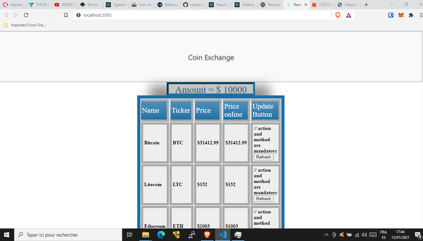
and for the action and method are mandatory

2 Likes

JSK:

import React, { Component } from 'react';
import './AccountBalance.css';
import PropTypes from 'prop-types';

export default class AccountBalance extends component {
    render() {
        return (
            <section className="accountBalance-section">
                Balance: $ {this.props.amount}
            </section>
        );
    }
}

AccountBalance.propTypes = {
    amount: PropTypes.number.isrequired
}

CSS:

.accountBalance-section {
    border: 1px solid #cccccc;
    width: 25vh;
    font-size: 1.2rem;
    padding: 0.2rem;
}

Screenshot:

1 Like

AccountBalance.js:

 render(){
        return(
            <section className = "balance">
            ${this.props.amount}
            </section>
        );
    }

AccountBalance.css:

.balance section {
    display: block;
    color: rgb(43, 116, 61);
}
1 Like
AccountBalance.jsx
import PropTypes from 'prop-types';
import './AccountBalance.css';

export default class AccountBalance extends Component {
    render() {
        return (
            <section className="accountBalance">
              <strong> Balance: </strong> ${this.props.amount}  
            </section>
        );
    }
}


AccountBalance.propTypes = {
    amount: PropTypes.number.isRequired
}```

AccountBalance.css
    text-align: center;
    font-size: 1.4rem;
    color: greenyellow;
}

Coin Exchange Front

Still keeping things simple for now.

2 Likes
import './AccountBalance.css';
.balance-sec {
  border: 1px solid#cccccc;
  width: 25vh;
  font-size: 35px;
}

2 Likes

In AccountBalance Folder:

Create AccountBalance.css

In AccountBalance.jsx:

import ‘./AccountBalance.css’;

export default class AccountBalance extends Component {
    render() {
        return (
            <section className="balance">
              Balance: ${this.props.amount}  
            </section>
        )
    }
}

In AccountBalance.css:

.balance {
    width: 100%;
    font-size: 3em;
}
2 Likes